Information !
I'm Adrian Sadoun, welcome to my website. All elements on this page are moveable. To open them, just double-click on it.
All elements on this site
are movable.
Work
Font
About
FFFonderie
Colors
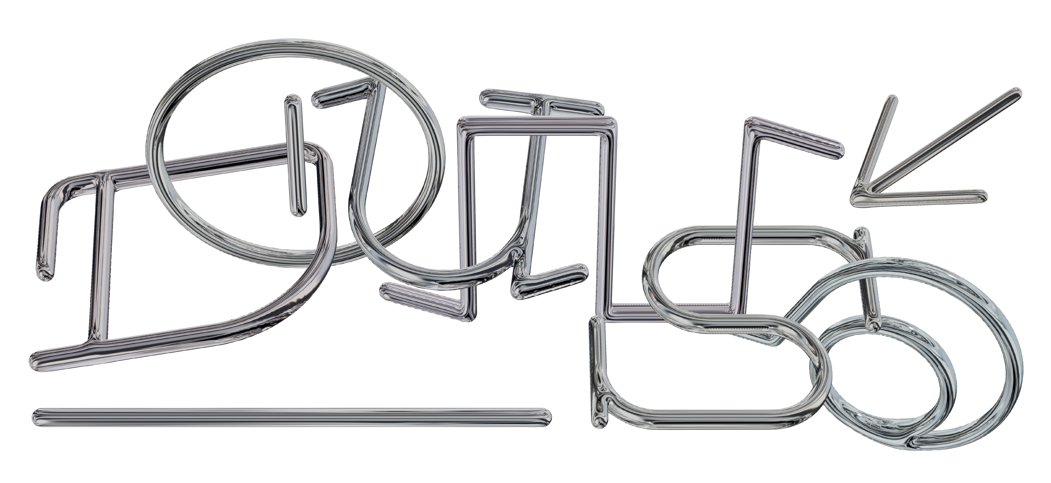
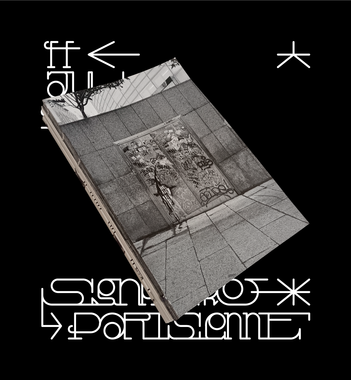
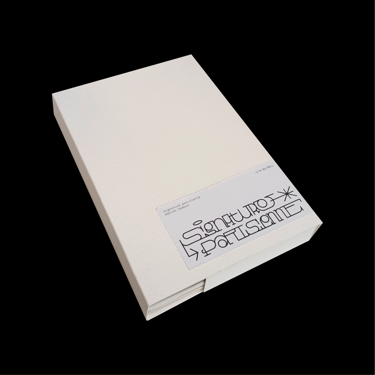
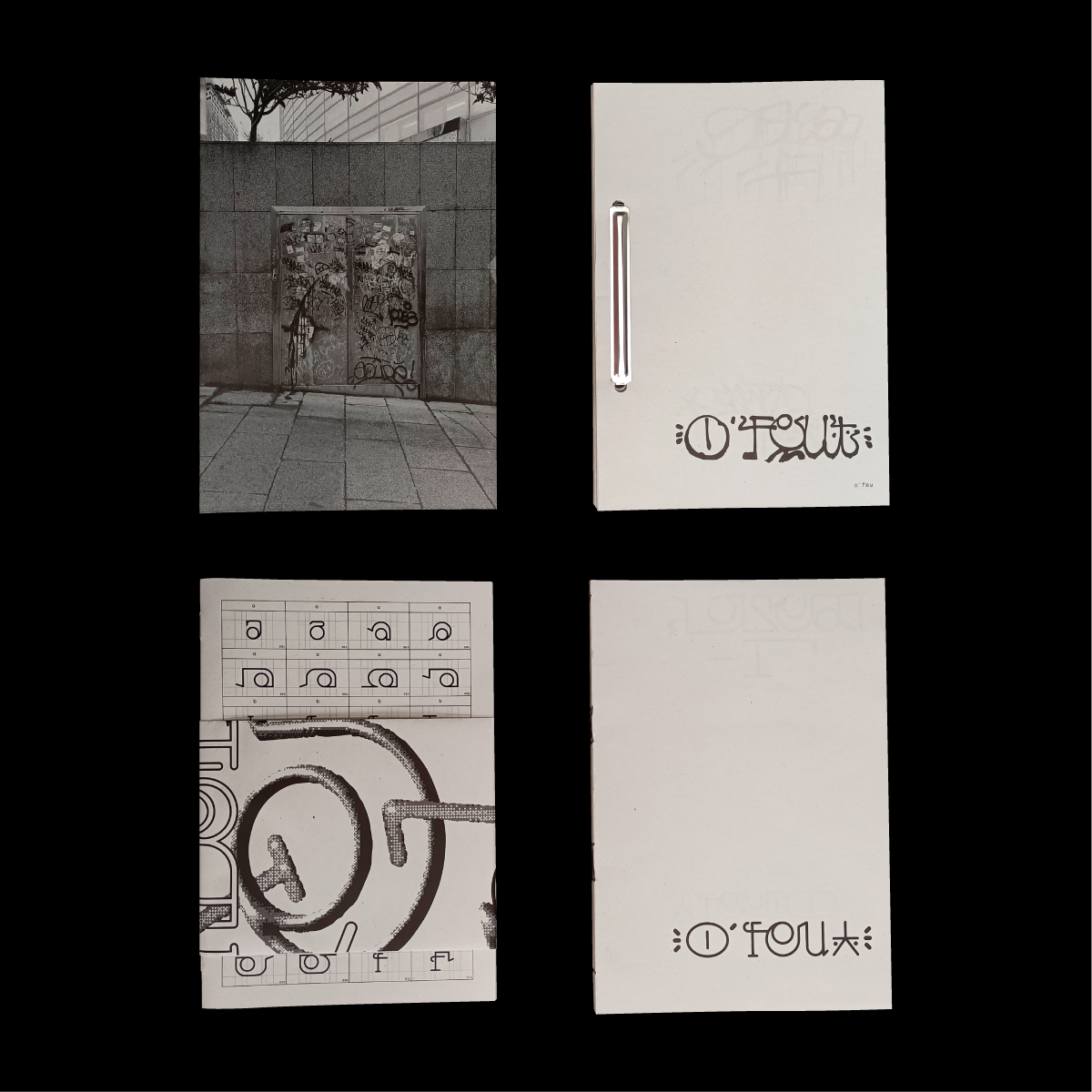
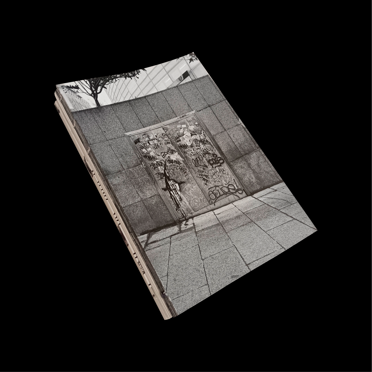
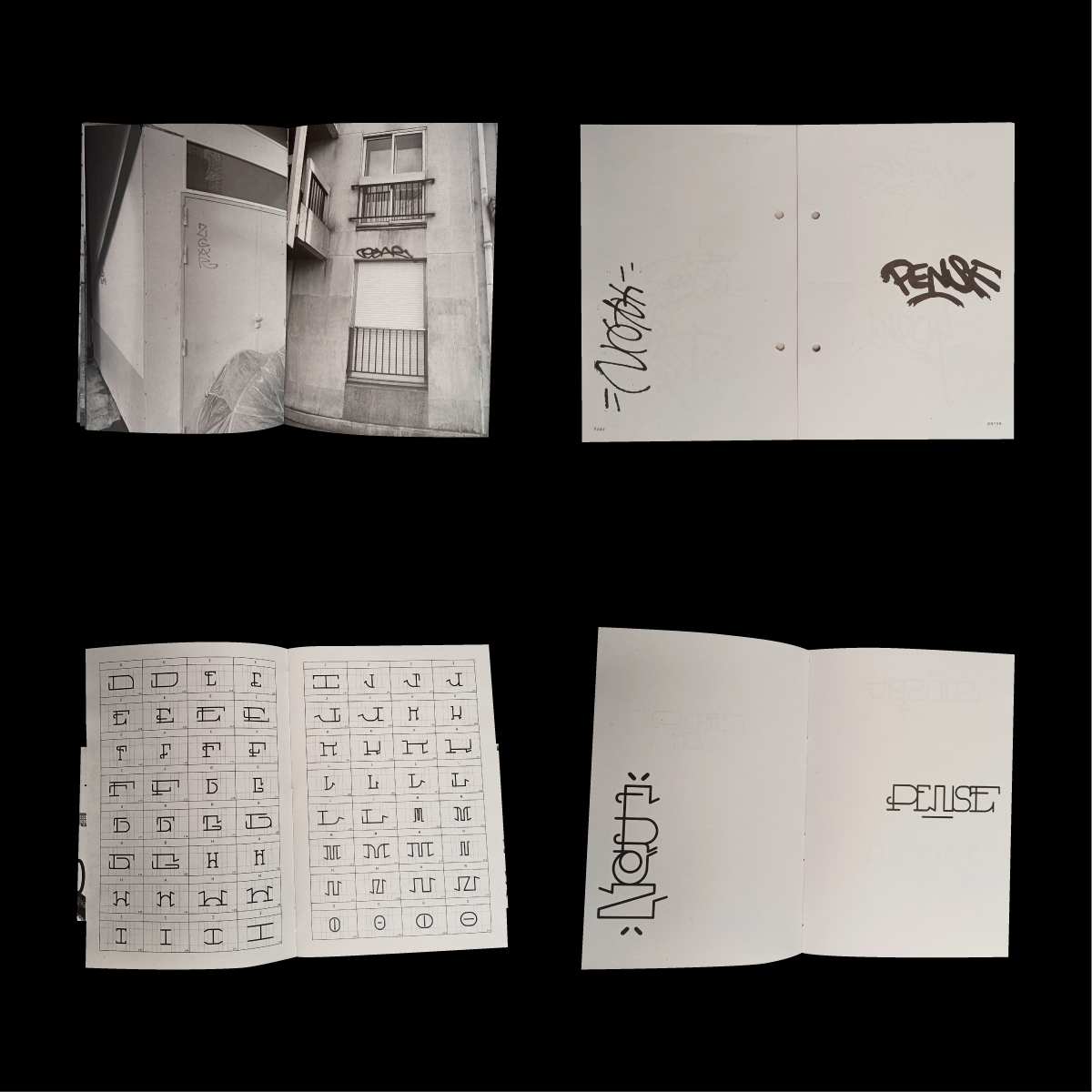
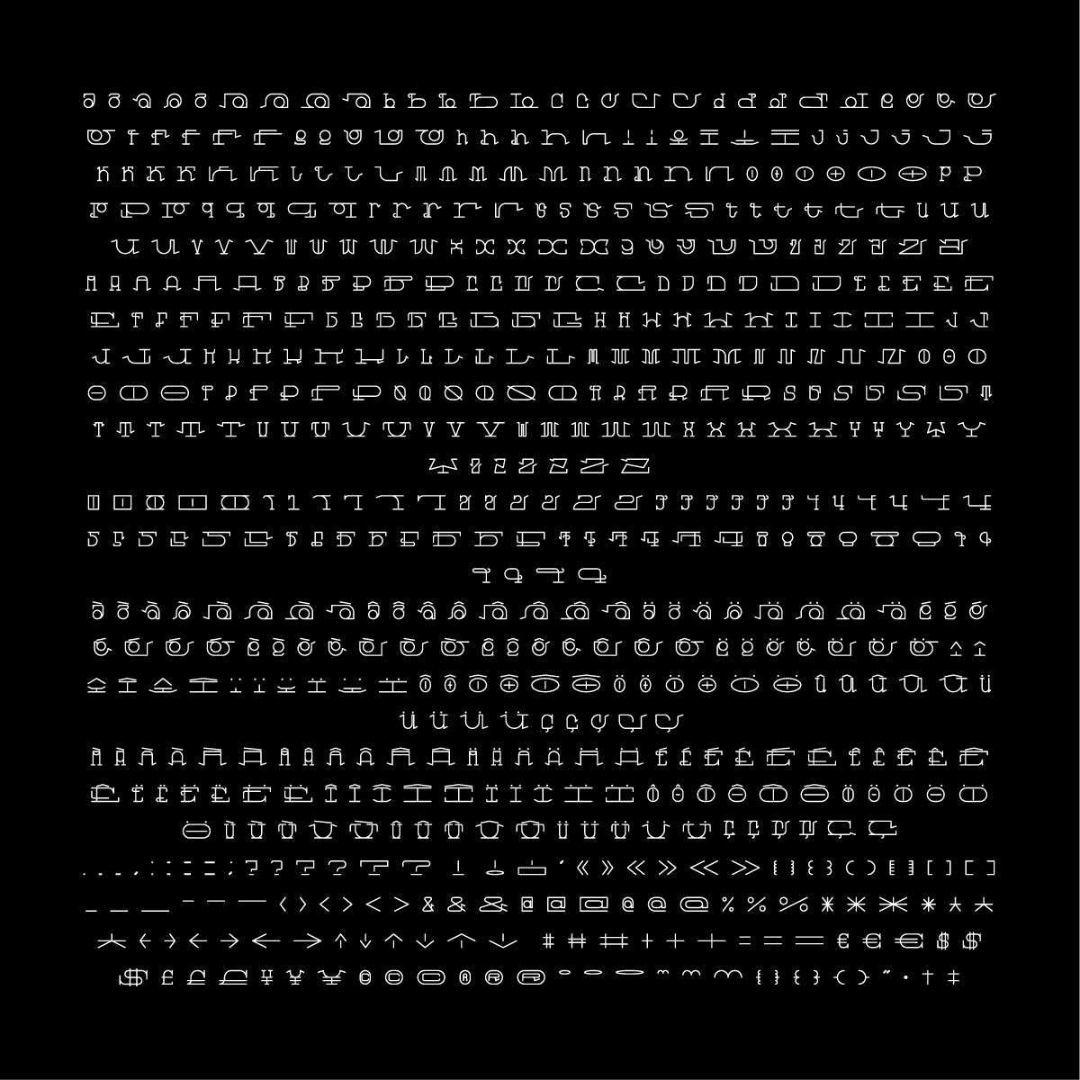
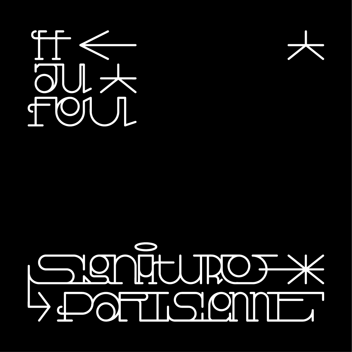
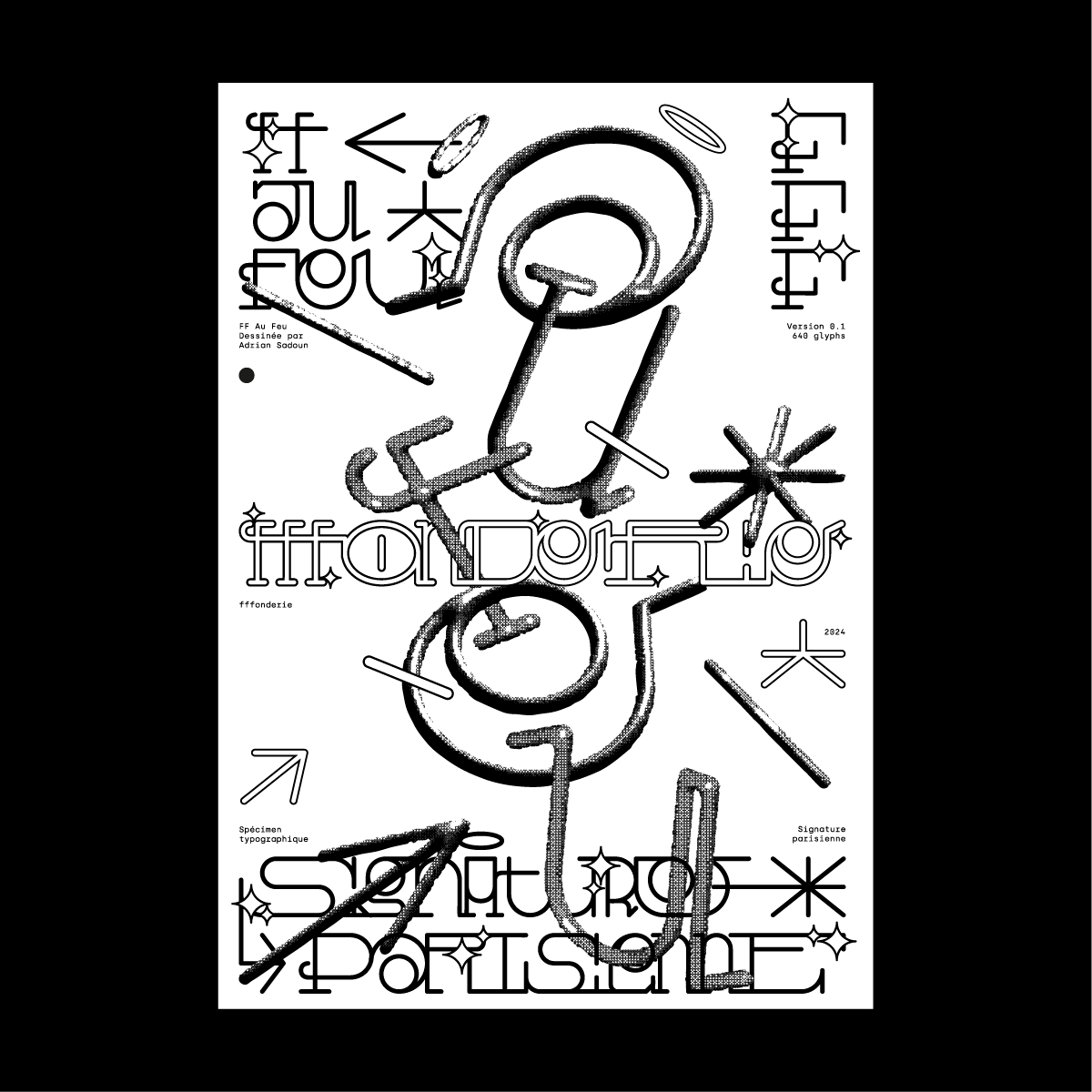
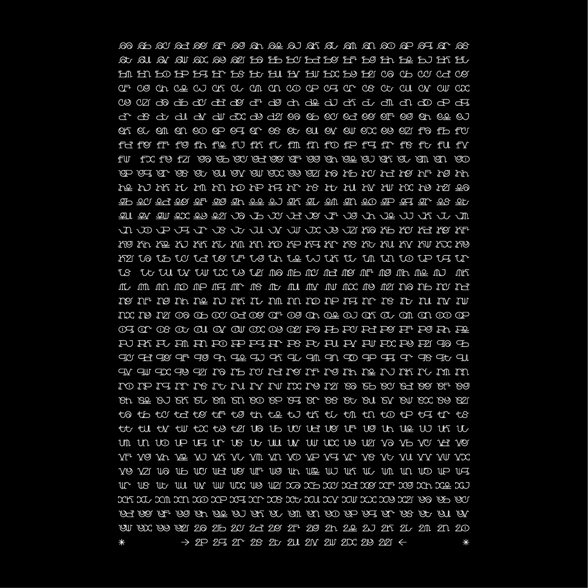
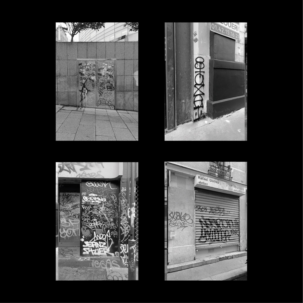
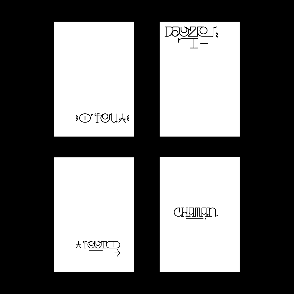
“Signature Parisienne” is my Master 2 final year project. The aim was to renew the creation of digital fonts by drawing inspiration from the aesthetics of graffiti. The project comprises four editions that retrace my process. The first is a photo book on Parisian tags. The second edition presents vectorized “signatures” of Parisian graffiti artists, each page containing a “signature”. I then chose the “O'feu” tag to create my font, which I named “Au Feu” in reference to its name. It incorporates variations on graffiti forms. It includes 640 glyphs, each letter with several versions, allowing users to compose their own ligatures. It also contains 676 ligatures composed by myself. The third edition is therefore the specimen of my font, and the fourth edition uses my typography to rewrite the names of the graffiti artists from the second edition. These four editions are collected in a folder called “Signature Parisienne”.

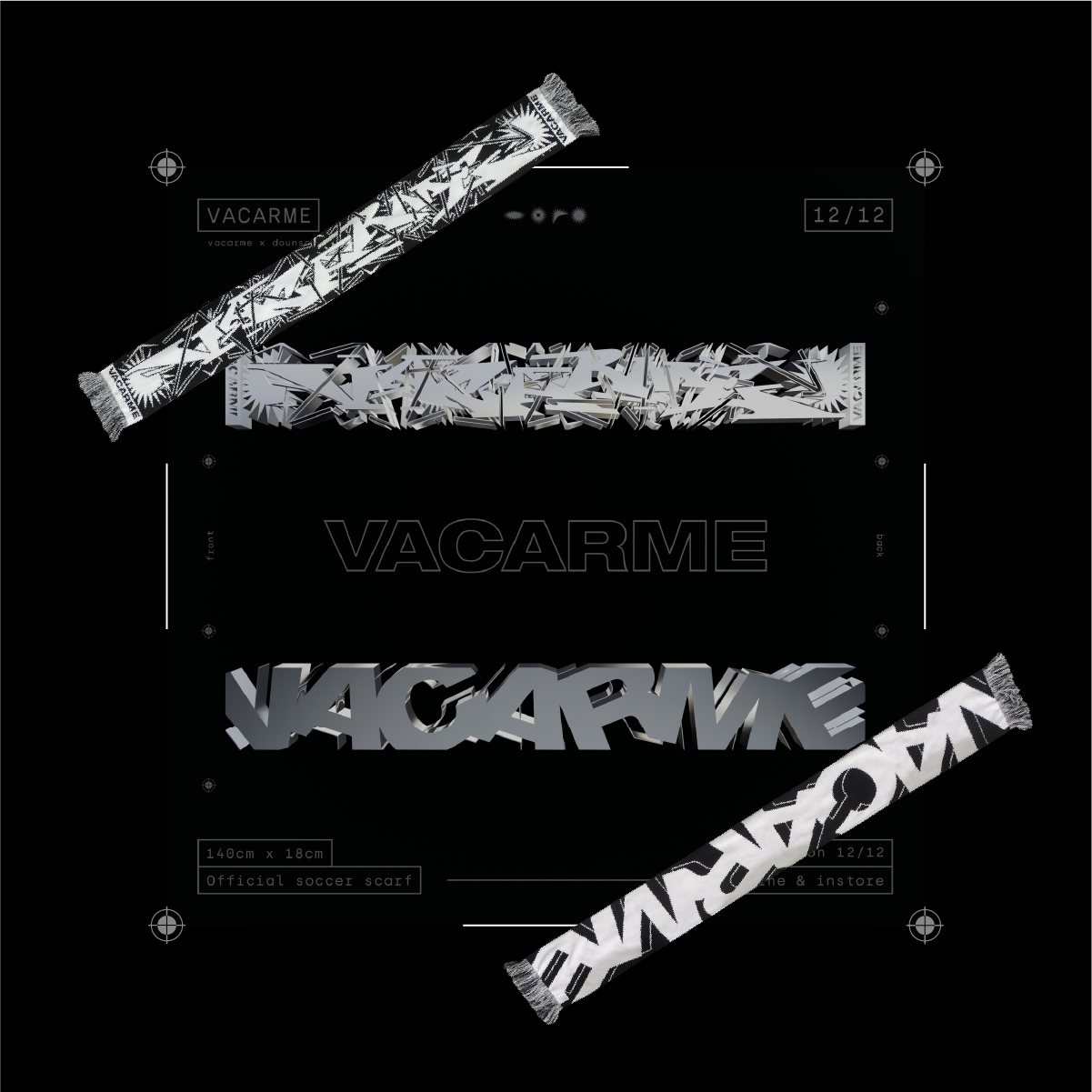
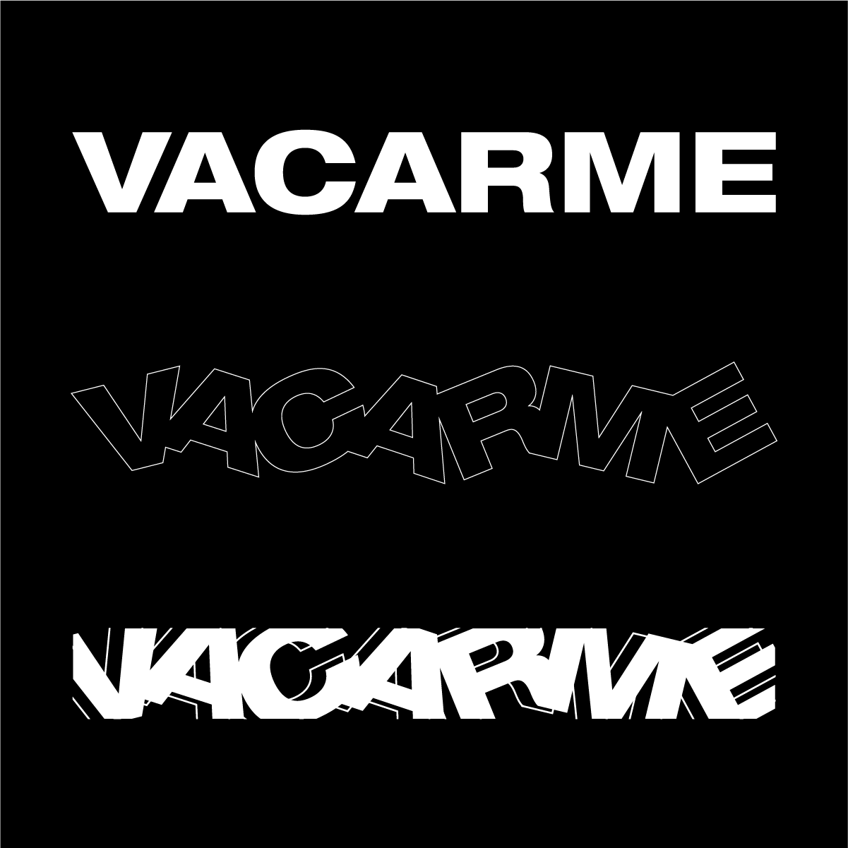
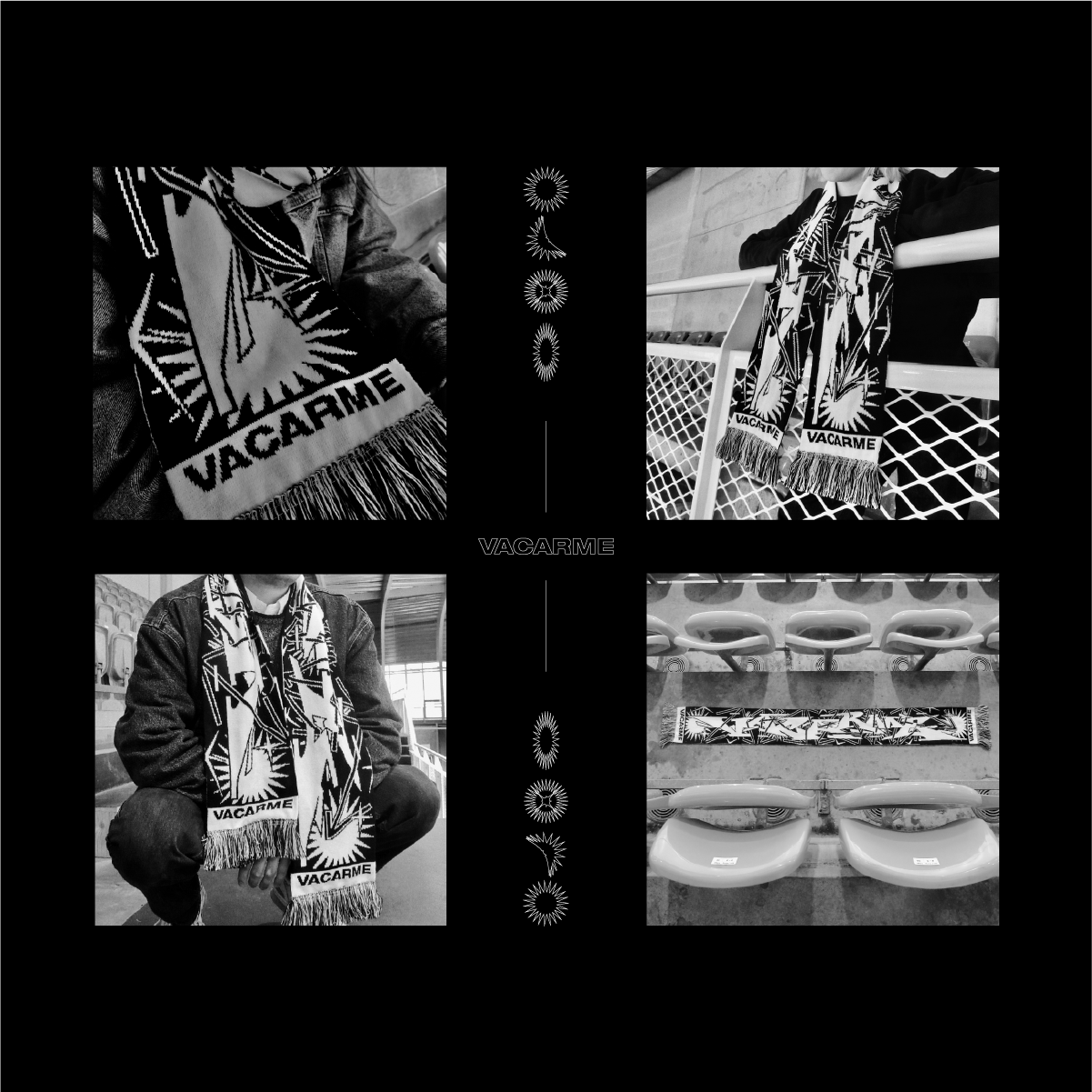
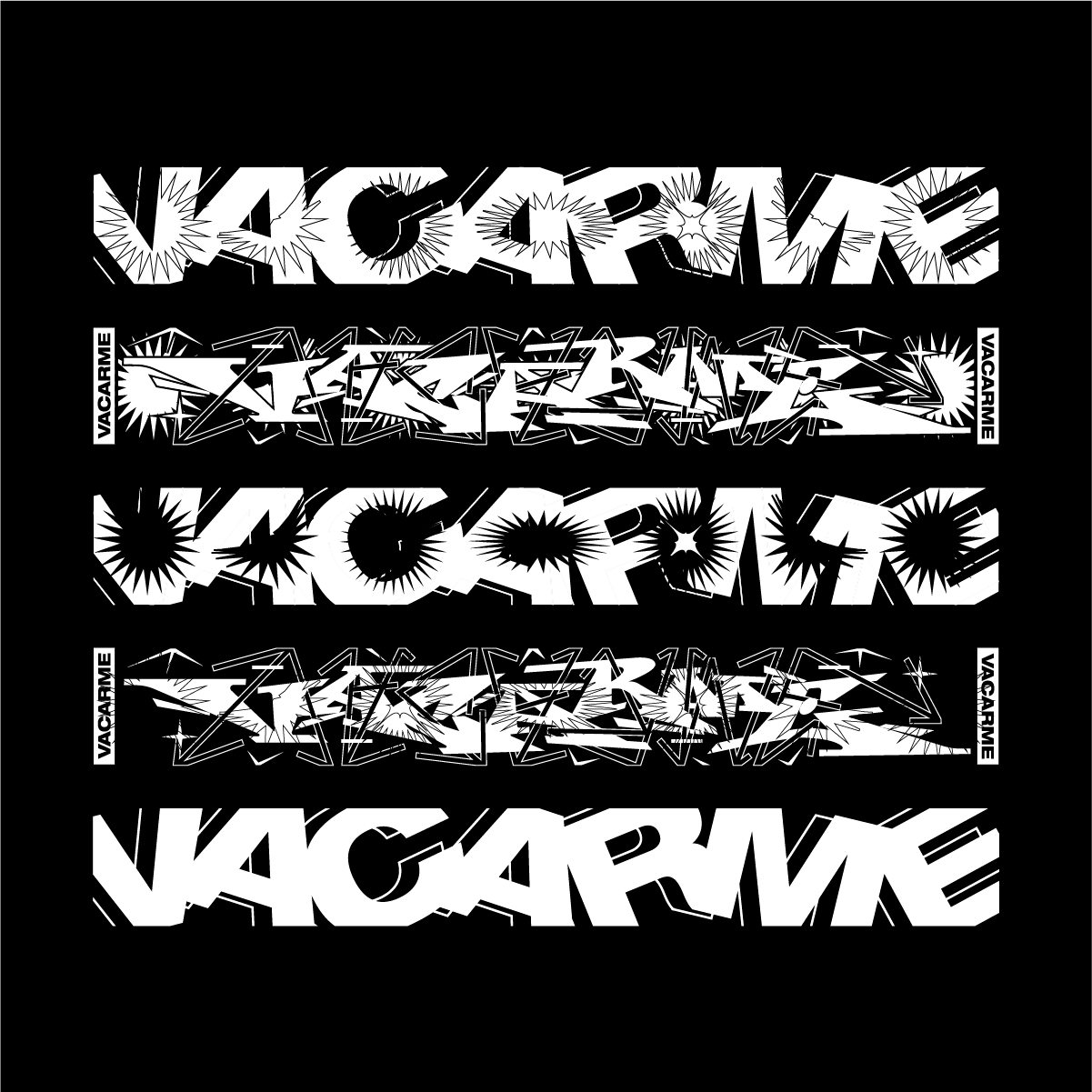
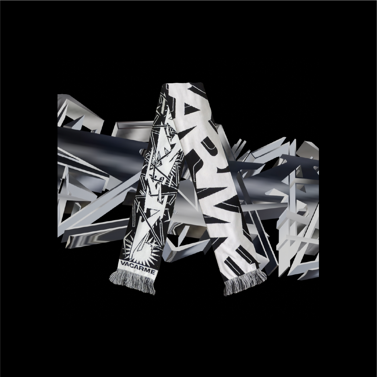
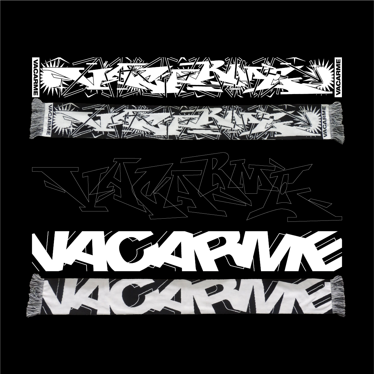
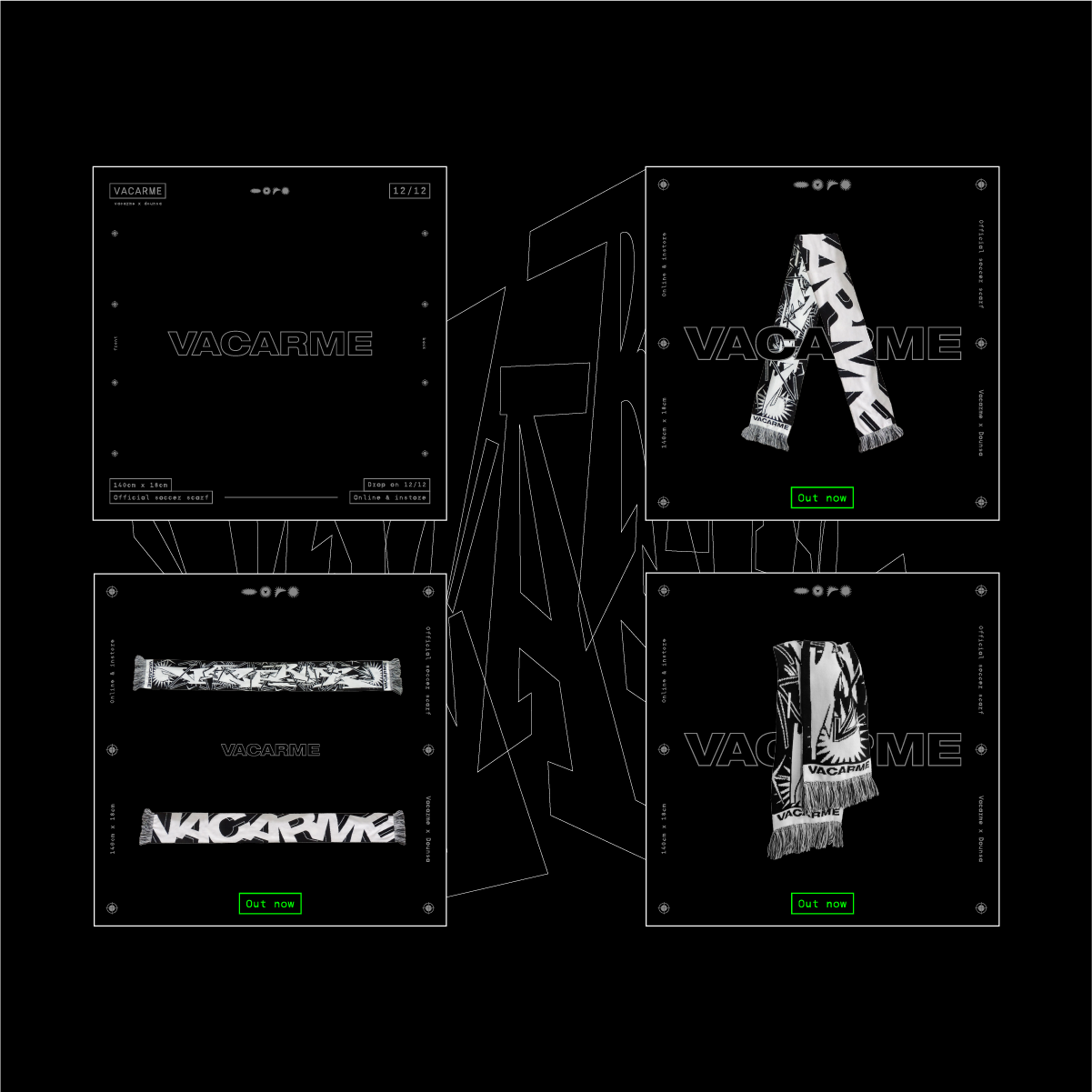
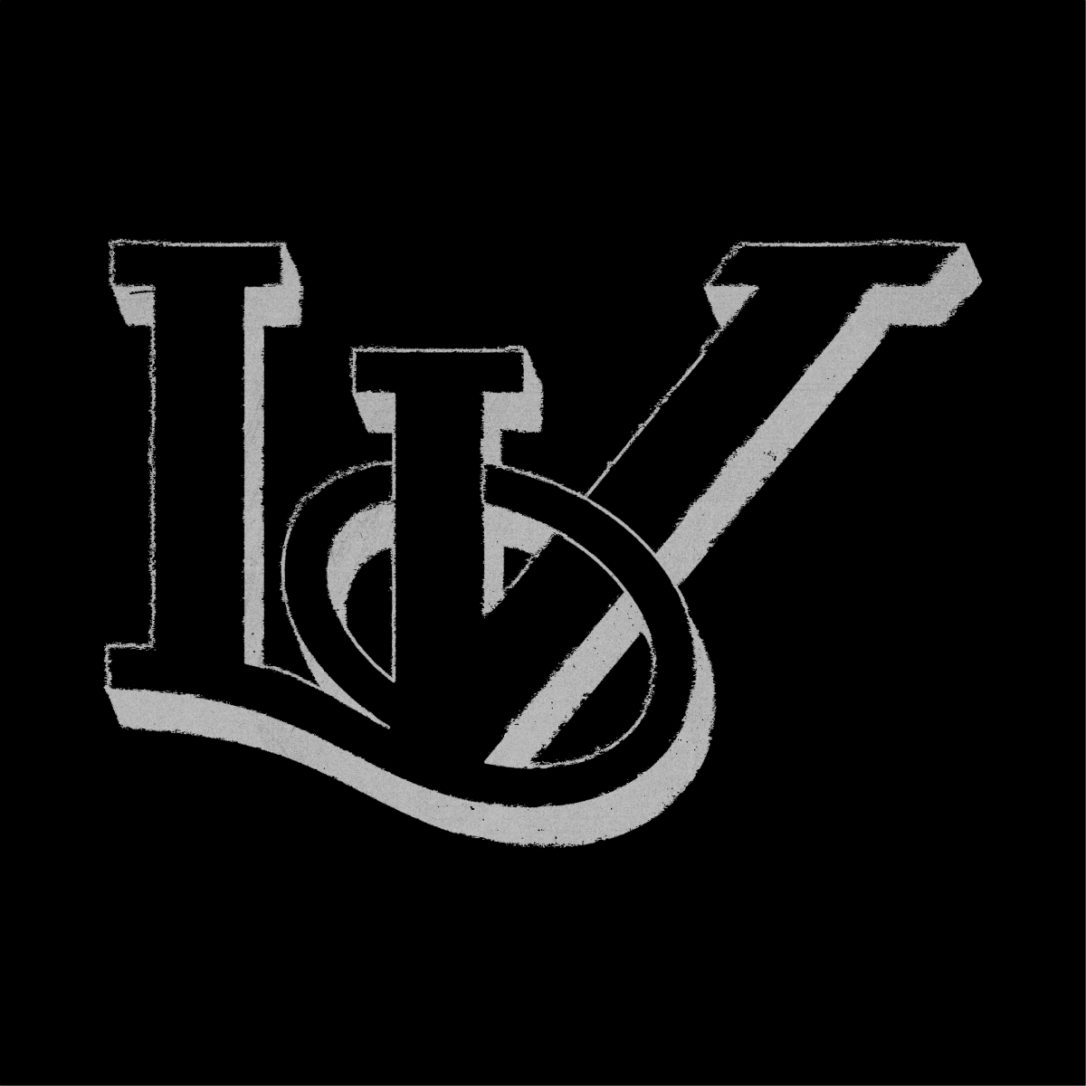
At the end of 2024, I collaborated with the clothing brand Vacarme. They reached out to me to work together on designing a scarf. The brand was planning to release a piece for Christmas, and since they appreciated my graphic style, they thought it would be a great opportunity for us to collaborate. I had complete creative freedom, I could do whatever I wanted, as long as I respected Vacarme's visual identity and included their various logos in my design. For the first side of the scarf, I combined two custom typefaces I had created. They interlock with each other—one reads upright, the other upside down. I then incorporated the brand’s logos seamlessly into the composition. For the second side, I started with their main logo, aiming for a more minimal look. I rearranged the letters differently and added a side stroke to create a subtle 3D effect. As part of the collaboration, I also handled the creative direction for the Instagram posts announcing the project.
I produced 3D animations where both sides of the scarf move and align over each other (these can be seen on my Instagram: @dounsarchive). However, I was not involved in the photoshoot.
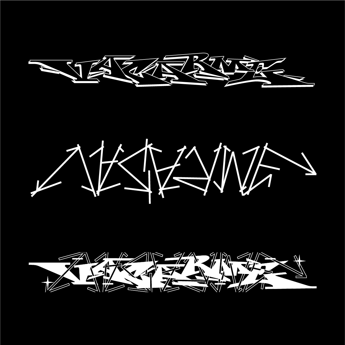
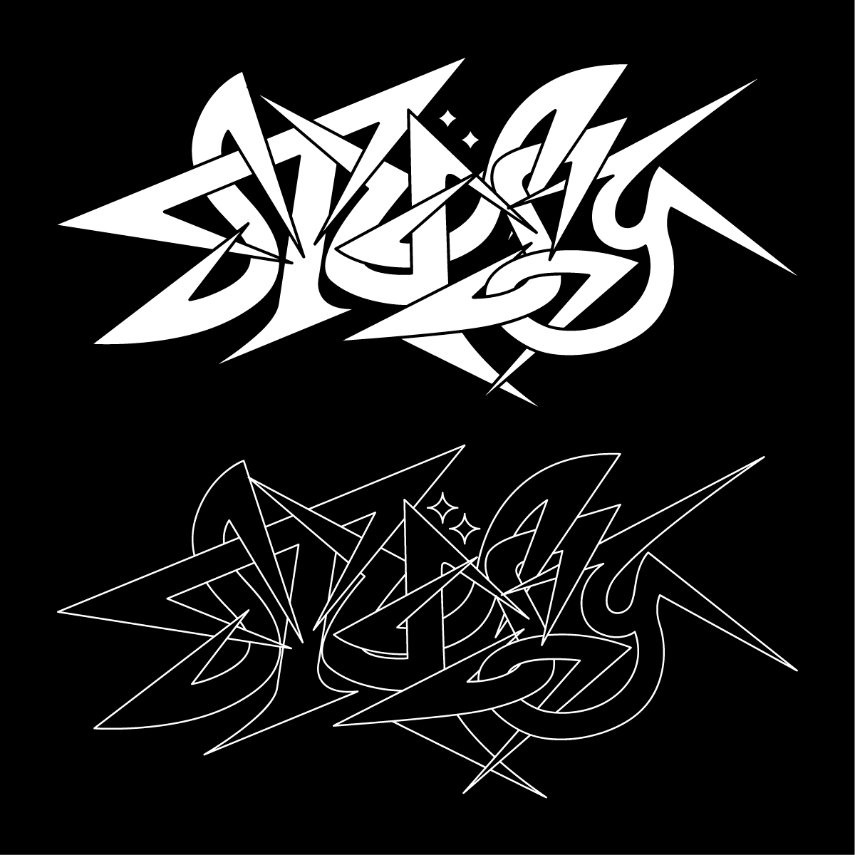
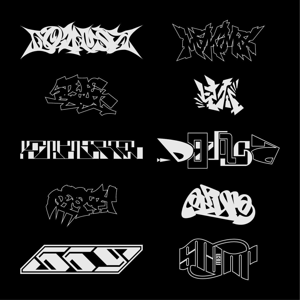
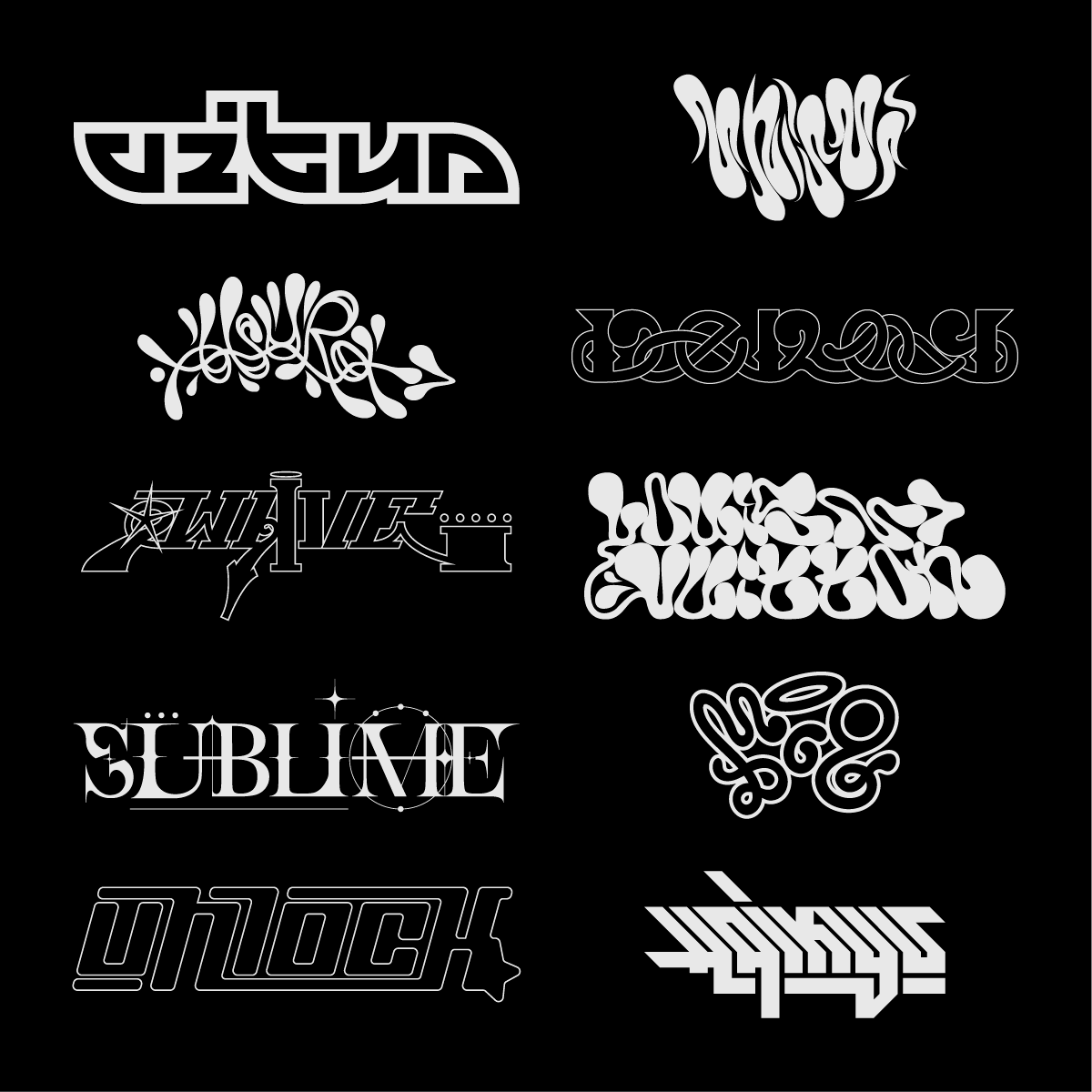
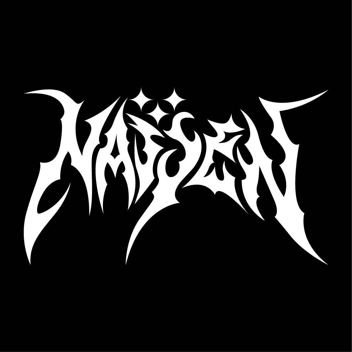
My passion is typography, and I love designing and composing logotypes. Each time, I try to draw different letters to obtain different styles. Here's a selection of some of them, some are my own creations, others are professional designs. I drew each of these logotypes on paper before transferring them to the computer.
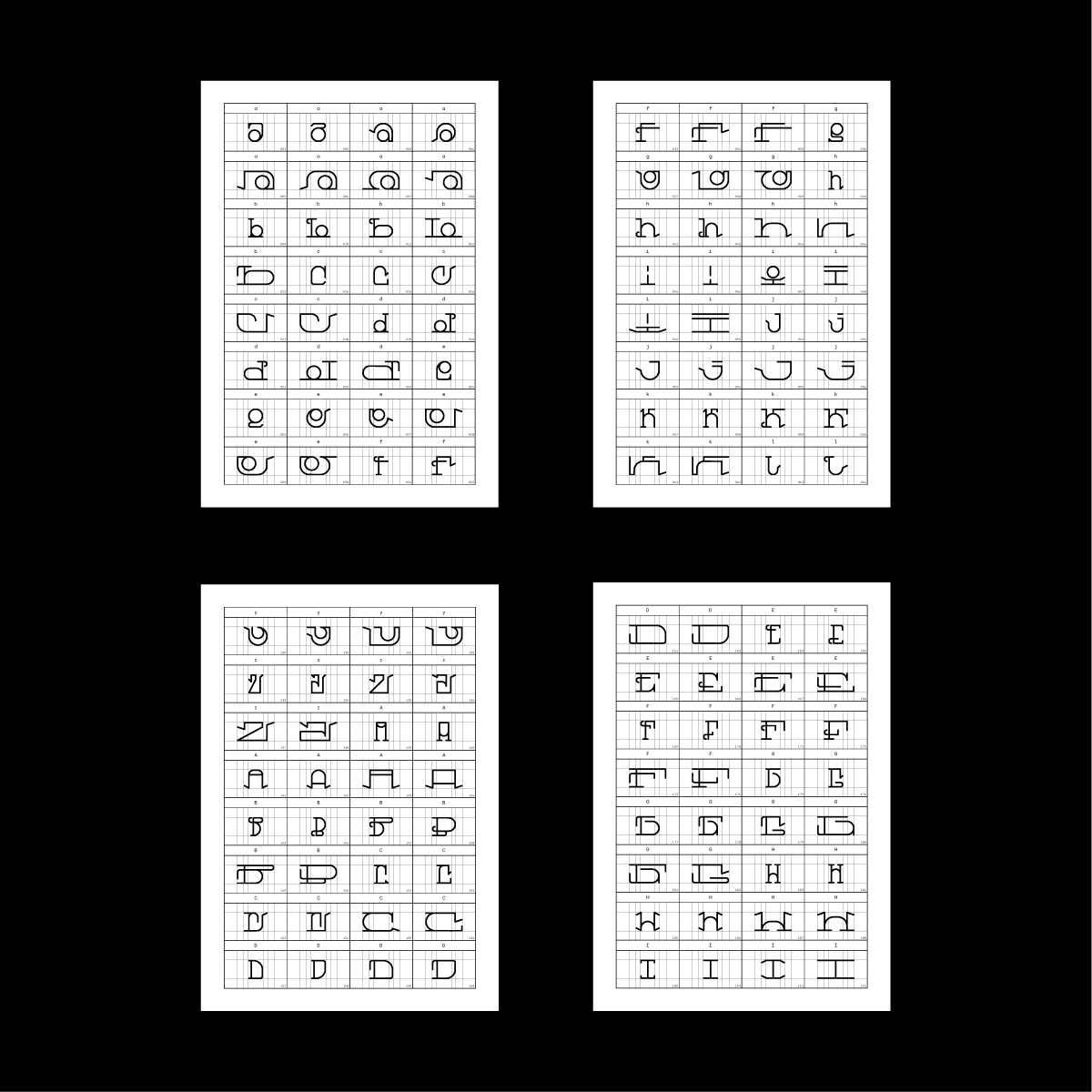
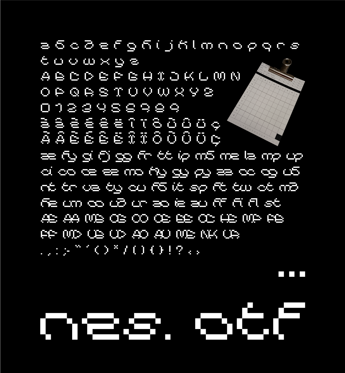
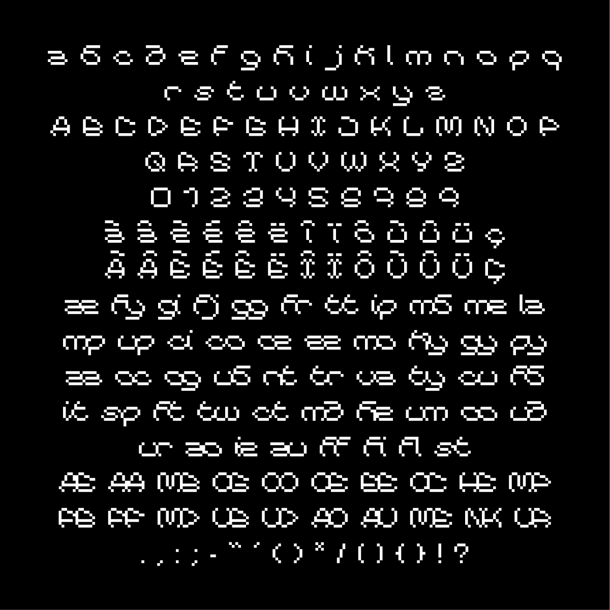
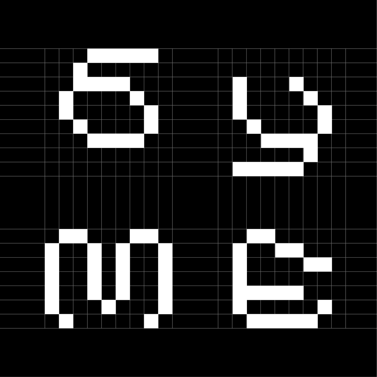
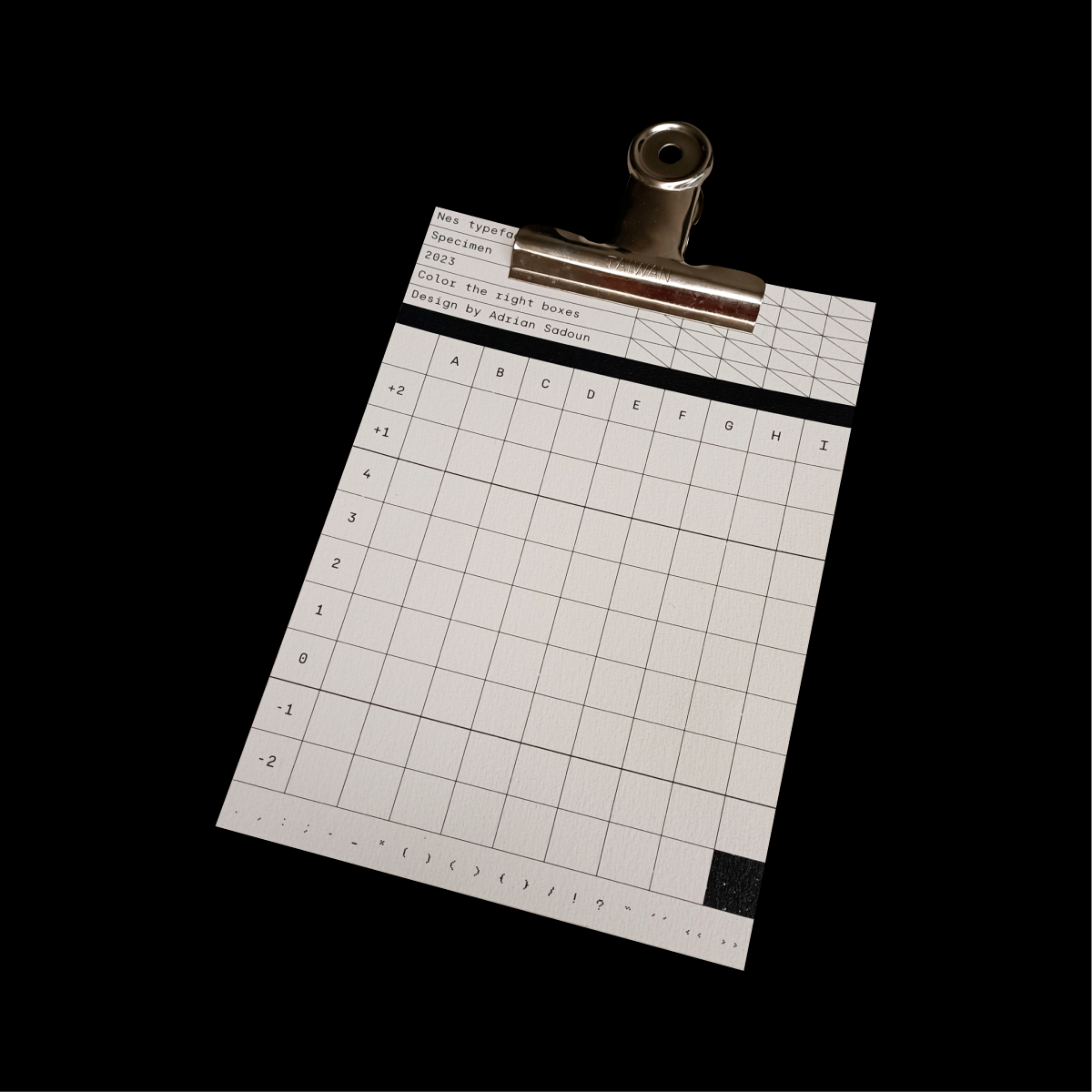
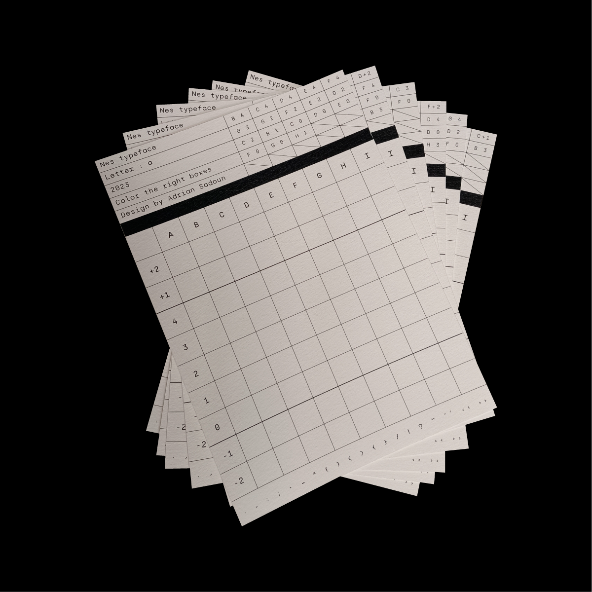
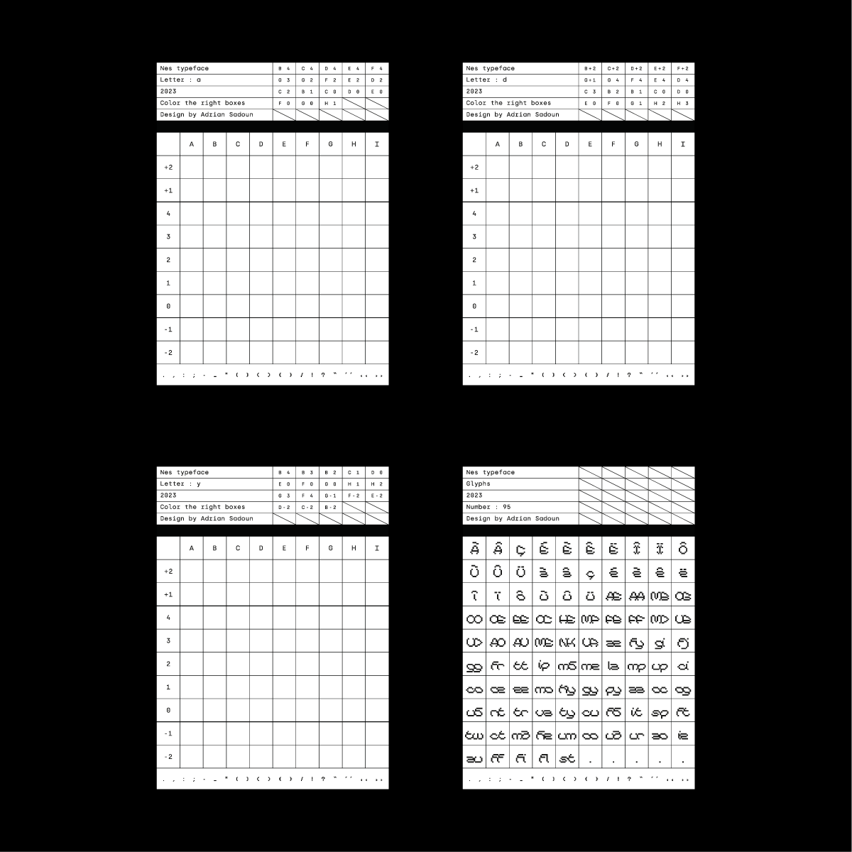
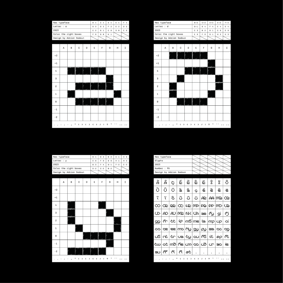
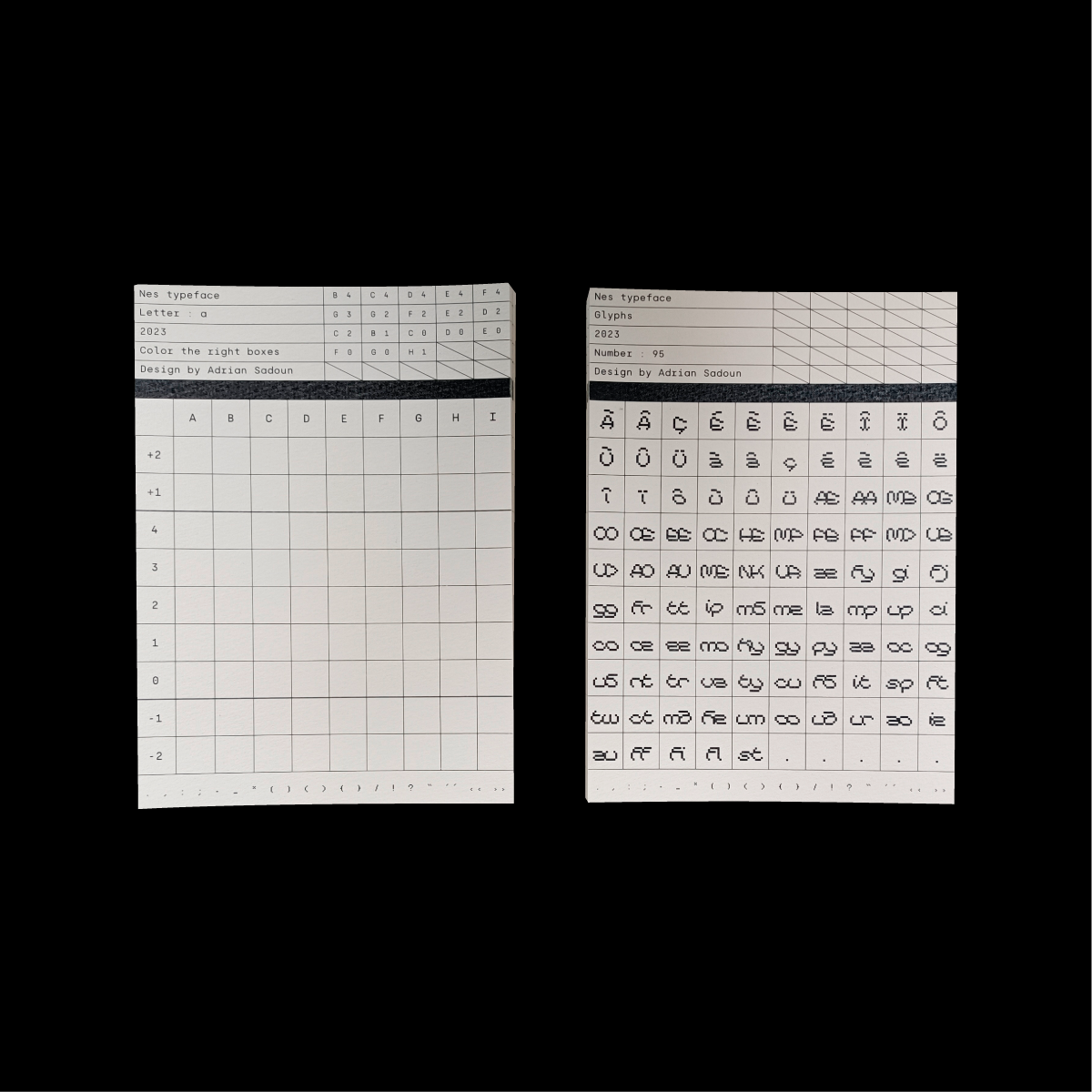
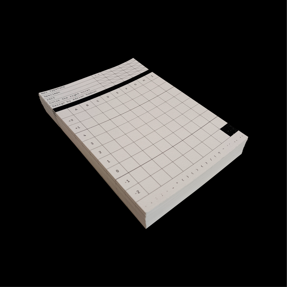
My half-brother is currently coding and developing his own video game. He told me he couldn't find a good font for it. So I thought it would be interesting to create the font myself. So I created this font, which is usable today and available on this site. I also created ligatures for this font, as I thought it would be interesting for a pixel font to have ligatures. I also created a specimen for my typeface. The principle is that each page is a card, and each card represents a letter. At the top of each card, it says “Color the right boxes”, with numbers and letters next to them (E 4, B-2, F 0 etc...). These numbers and letters correspond to the boxes below from A to I horizontally, and from +2 to -2 vertically. If B-2 is marked, I look at the point where line B crosses line -2 and color it in. When all the squares have been colored, the final letter appears (a letter from my font). These cards contain all uppercase letters, lowercase letters and numbers. There's an additional card containing all the ligatures.
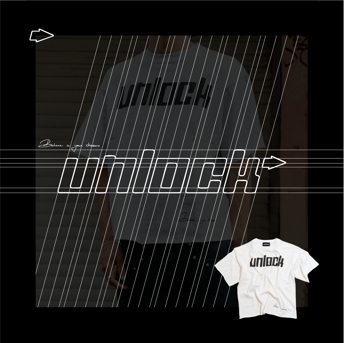
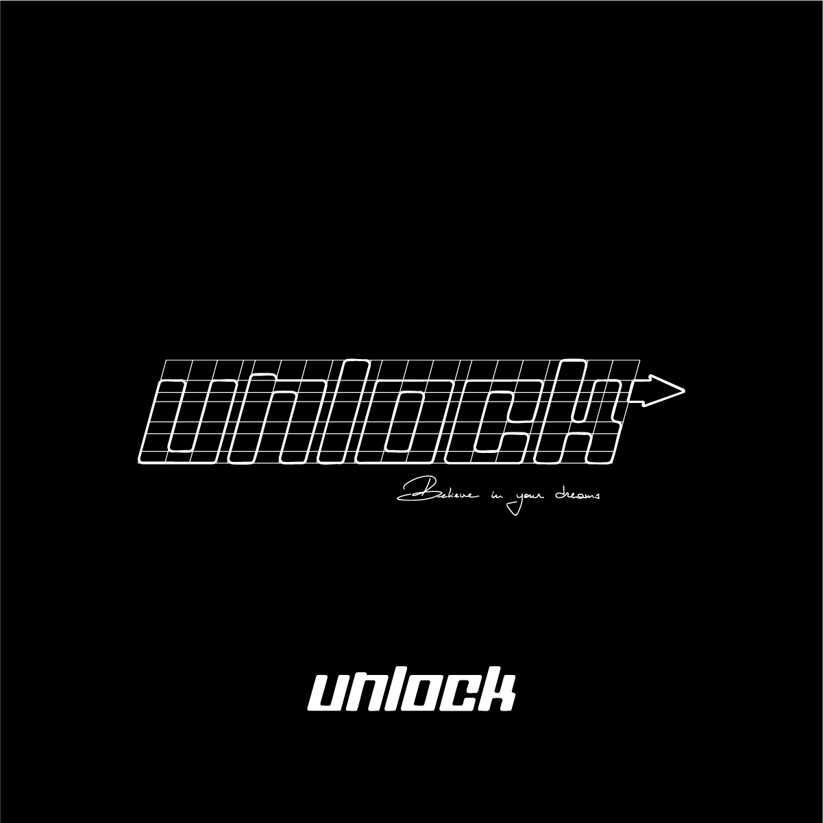
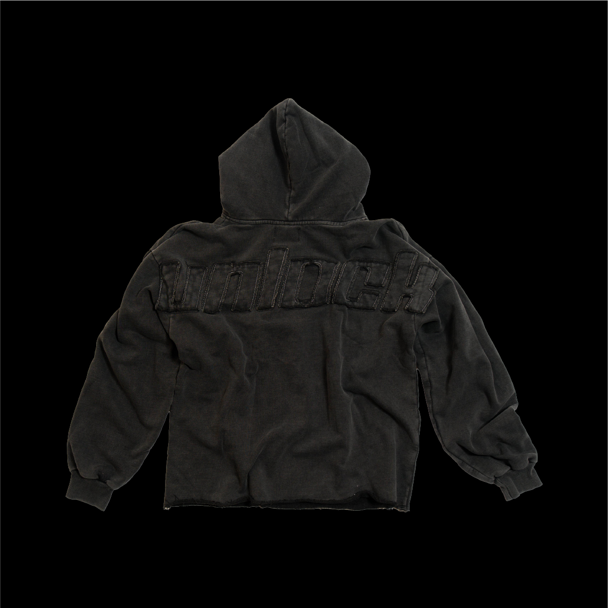
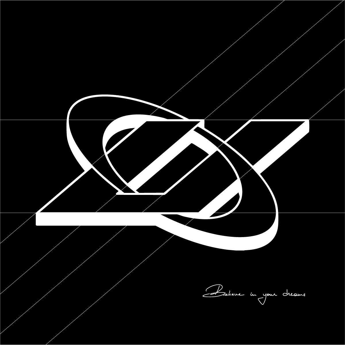
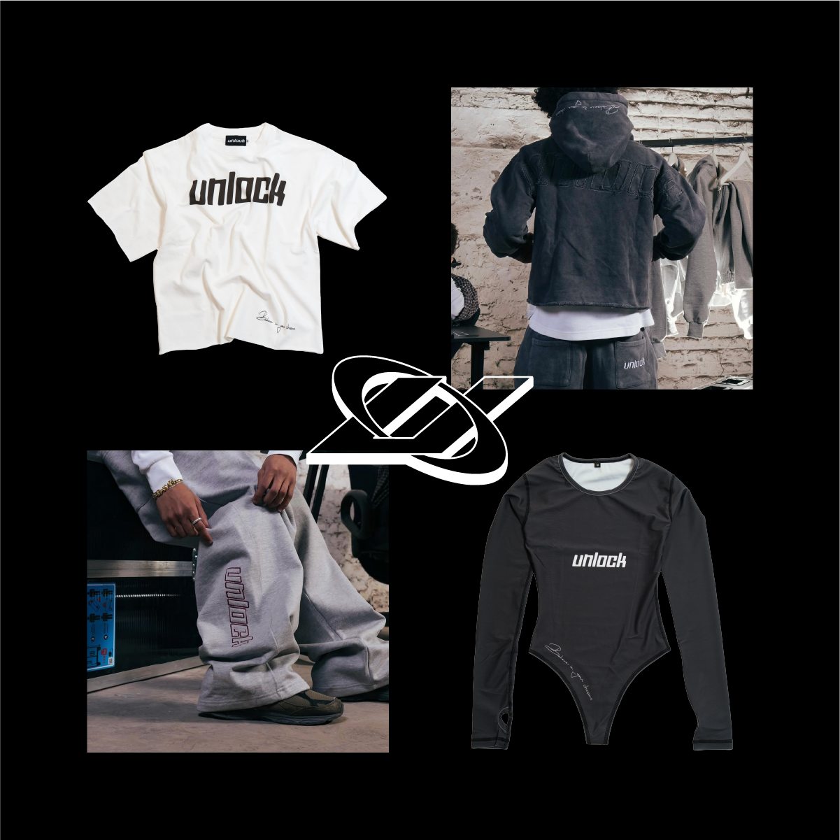
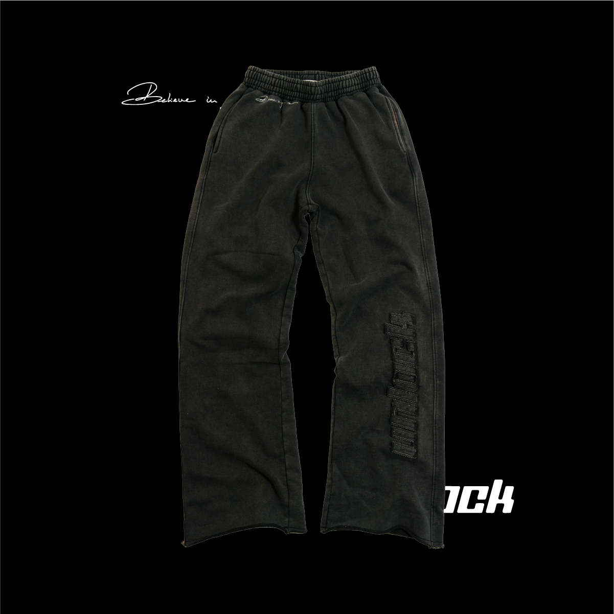
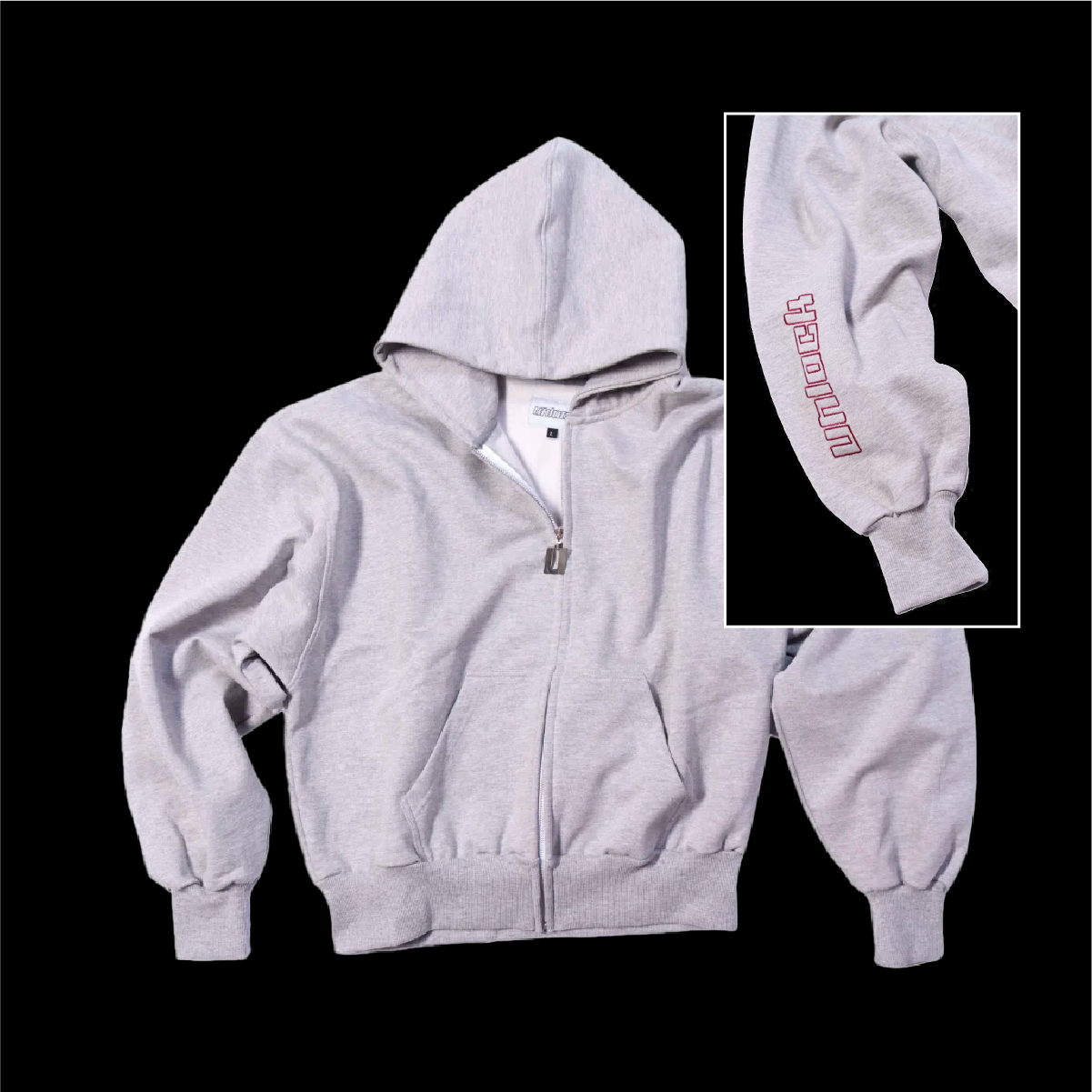
In 2024, the clothing brand Unlock reached out to me to design their logo as well as some graphics for their garments. They were looking for a classic Y2K-style logo,
so I created a custom design where each letter was drawn using a simple grid structure.
They also wanted a handwritten-style phrase, "Believe in your dreams", which I drew by hand and then vectorized.
I also designed a simplified version of the logo: a stylized “U” for Unlock,
in a Y2K aesthetic, surrounded by a ring.
I wasn’t involved in the rest of the project, but I’ll be working with the brand again later this year for an upcoming drop.
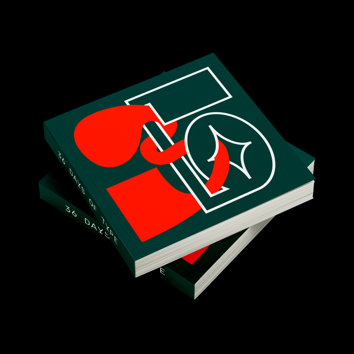
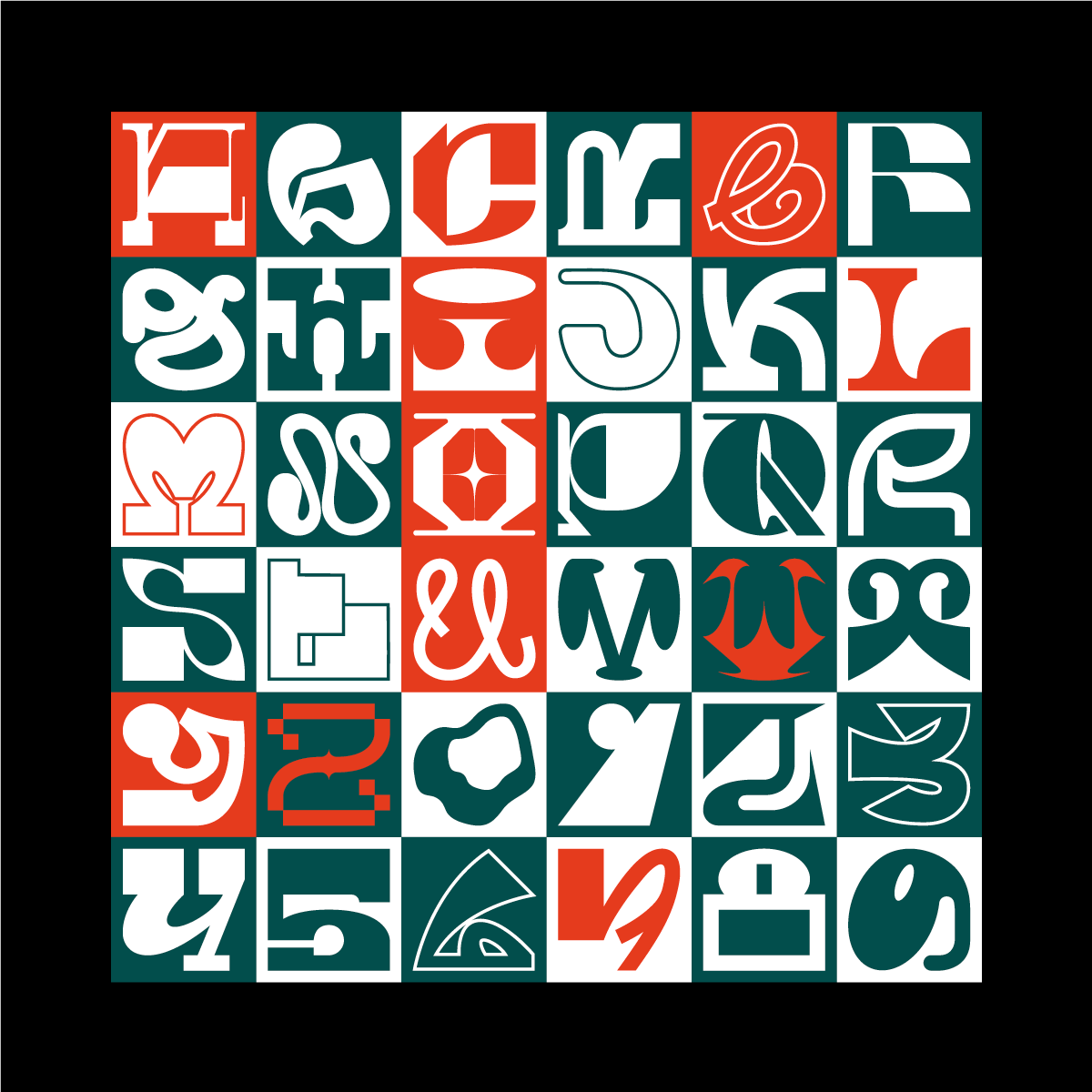
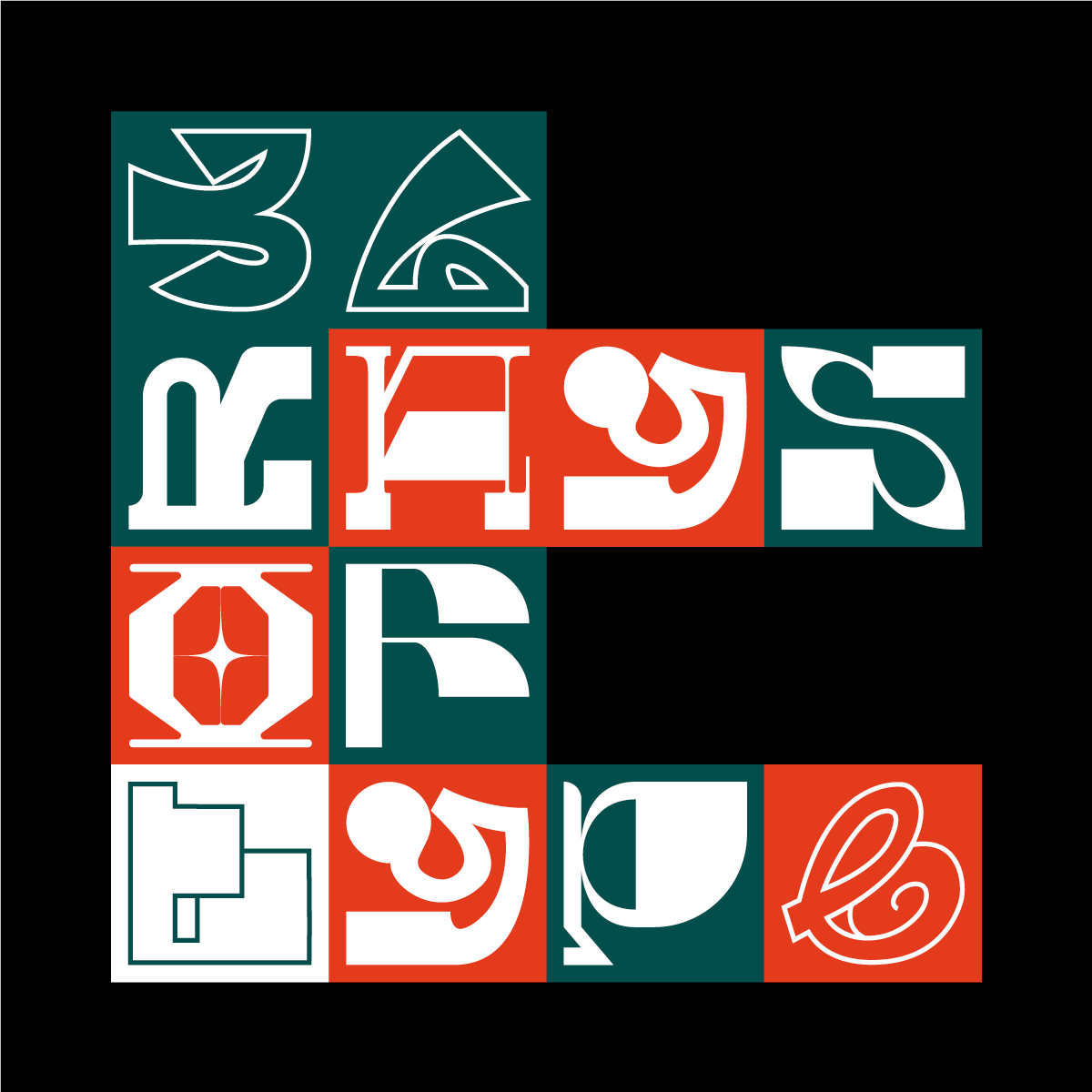
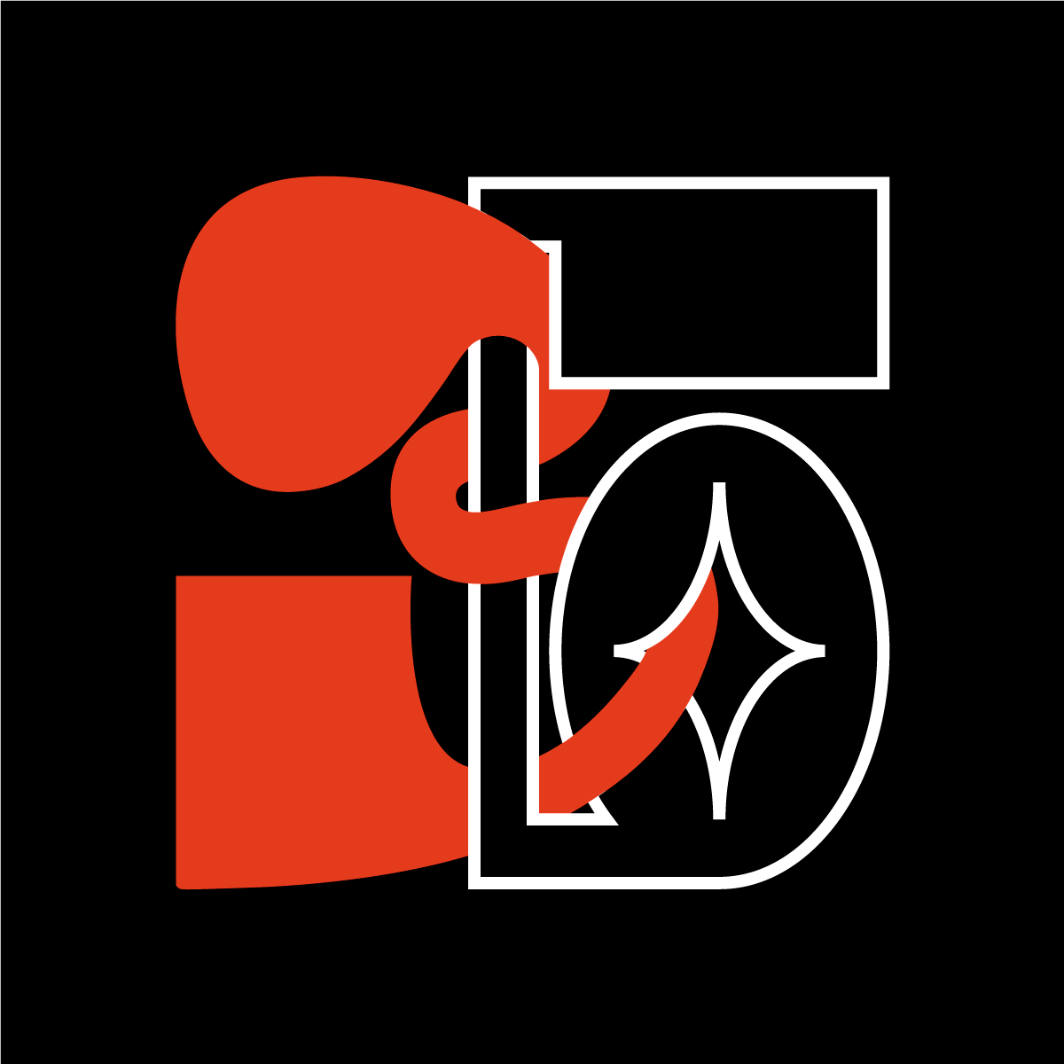
36 Days of Type is a project that invites designers, illustrators and visual artists to express their unique interpretation of the letters and numbers of the Latin alphabet. The aim is to design a letter or number every day for 36 consecutive days, in order to create a complete alphabet, including the numbers. So I decided to take part in this project and make an edition for one of my Master 1 courses. I thought it would be interesting to make a leporello edition, so that if you unfolded the whole thing, you'd have a sort of poster. The cover of this book could be torn off, and you'd get a square poster on which you could see my whole alphabet. The cover could also be left on to keep the book format. I first drew all the letters by hand, then traced them on the computer.
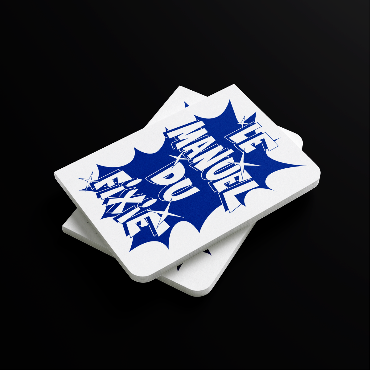
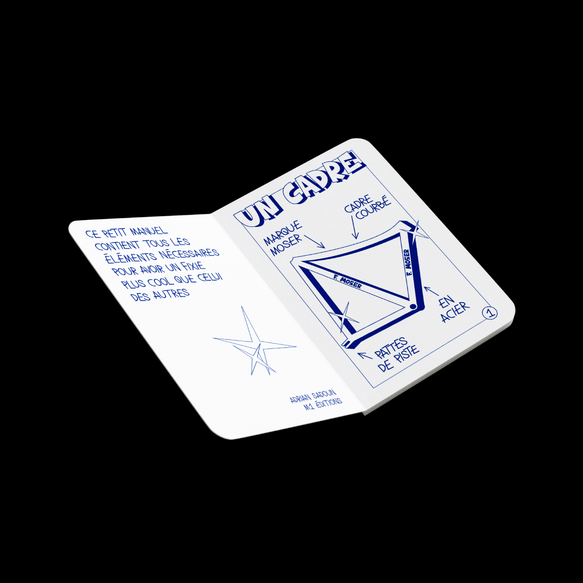
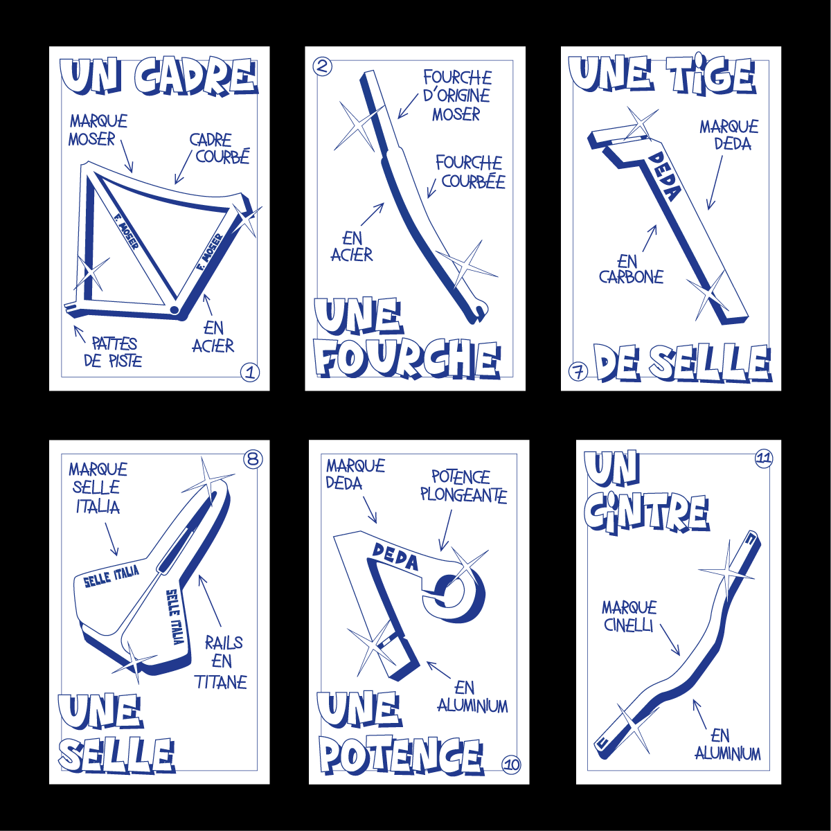
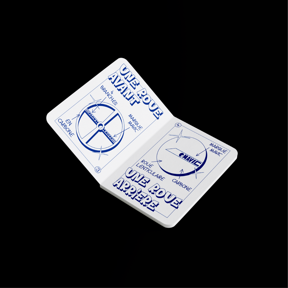
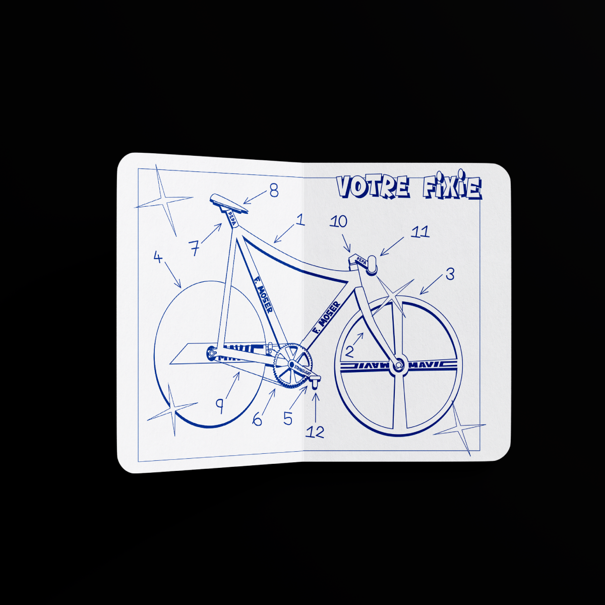
The fixie manual is a leporello edition. The aim of this manual is to show which parts you need to buy to build your own fixie. The manual is humorous, as all the brand-name items I mention in it are very expensive and are not compulsory for riding a fixie, they just look better and cooler. The entire manual was initially created by hand, including all the drawings and typography. I then redrew everything on the computer to get a more professional look.
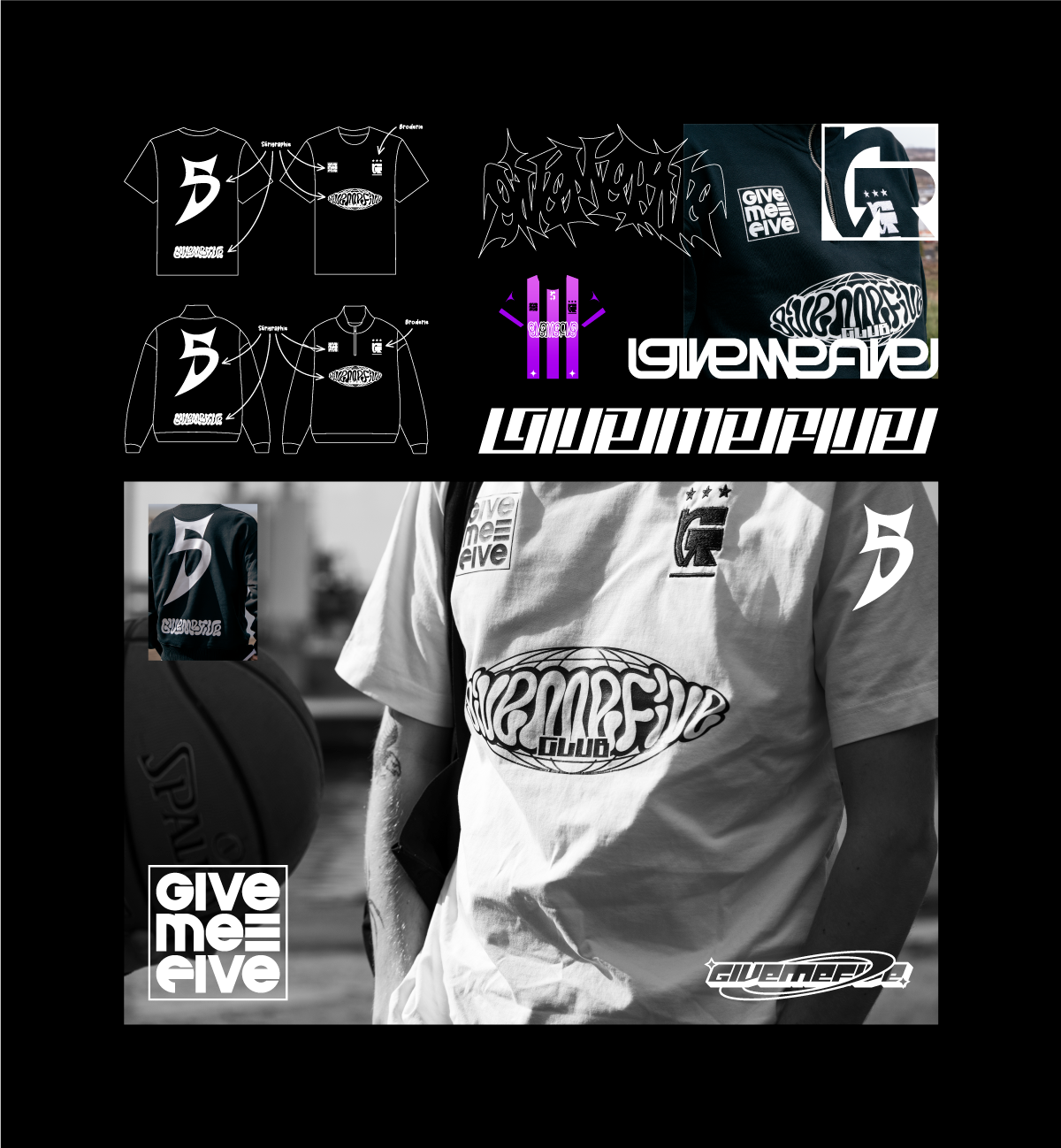
During my first year of my Master’s program, I interned at Smartex, a company specializing in textile printing. Givemefive, a sports-focused textile printing company, was also based at the same location.
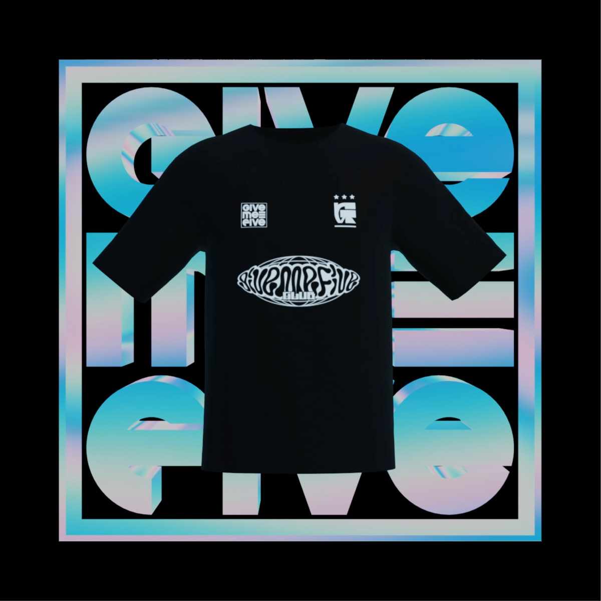
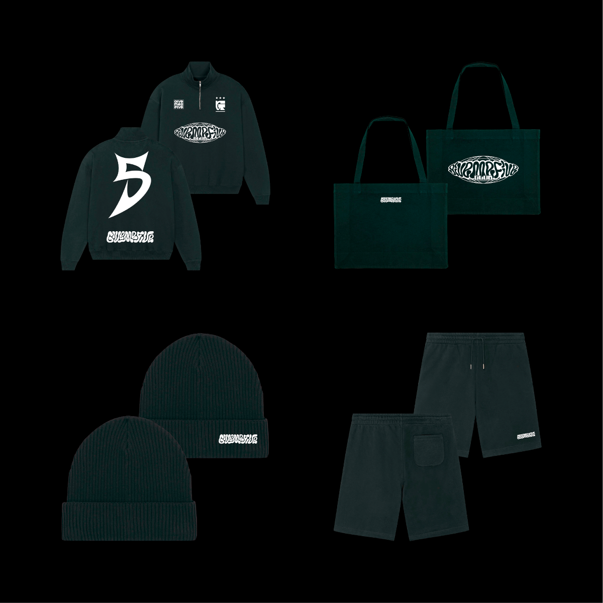
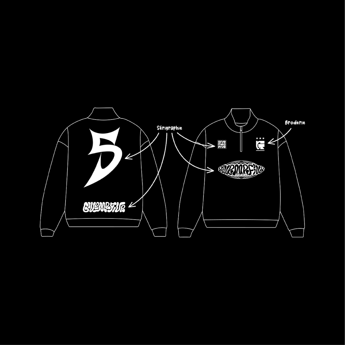
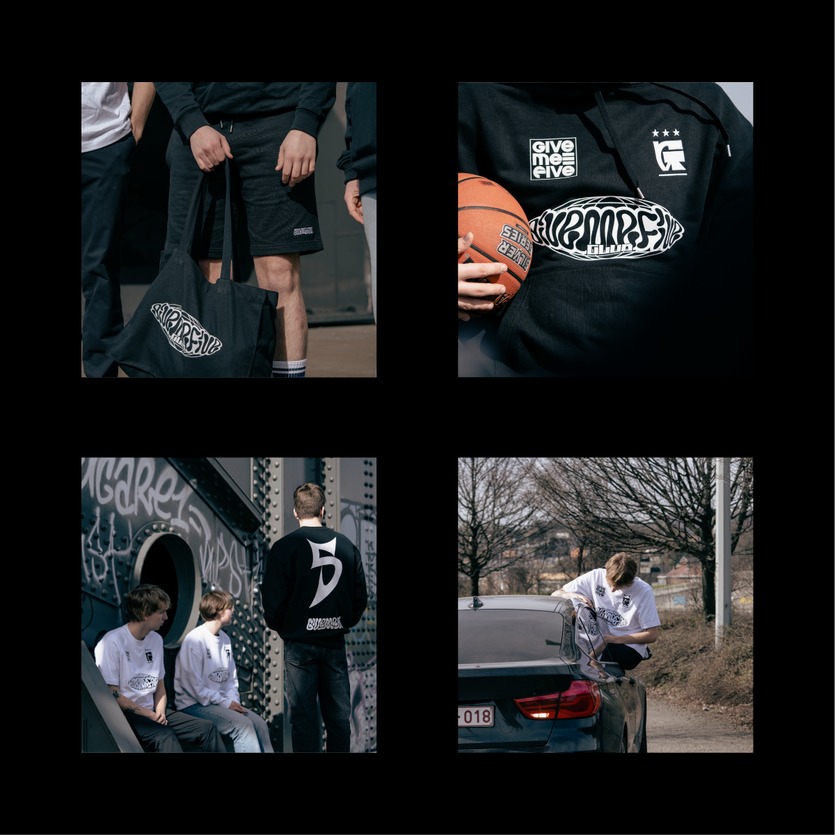
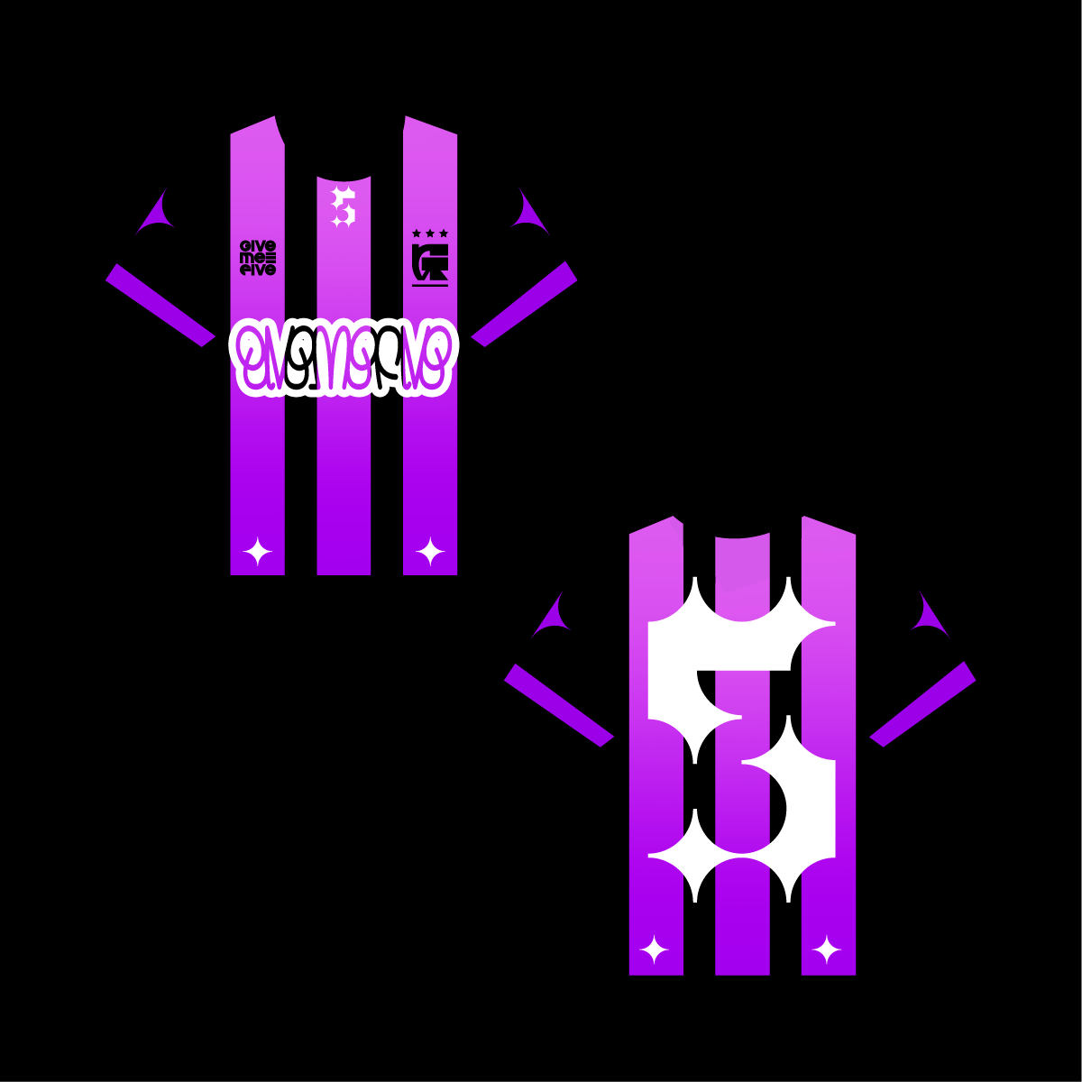
Givemefive wanted to launch its own clothing line to sell to its partner teams. I was asked to create visual designs and logos for the brand. I designed several custom typefaces and logotypes, and some of my visuals were selected to be printed on various products (t-shirts, sweatshirts, tote bags, etc.).
Together with another intern on site (@tinmar.off_), we handled the entire artistic direction of the project, including Instagram, the website, and overall communication. We were the ones who launched the brand.
I personally created 3D animations of the
t-shirts so they could be posted on their social media channels.

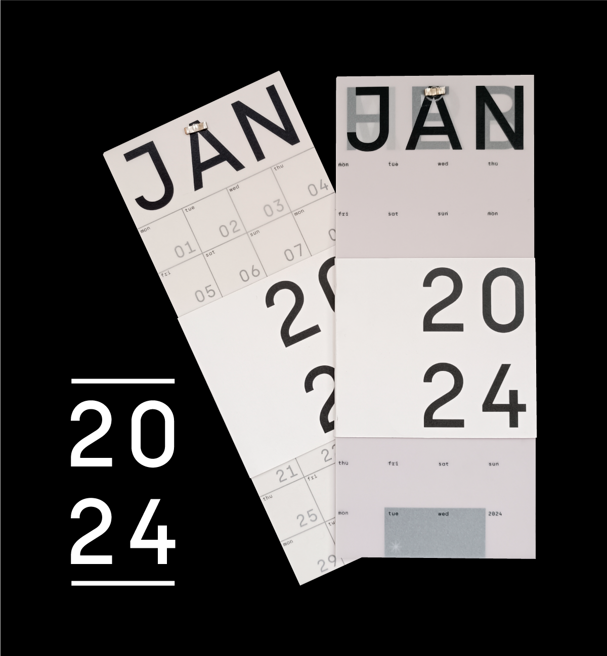
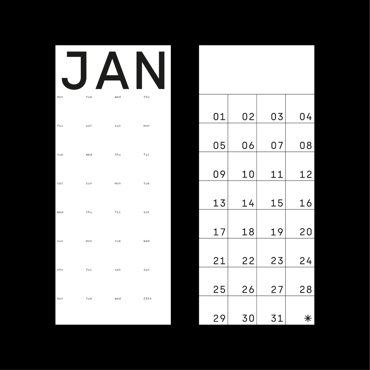
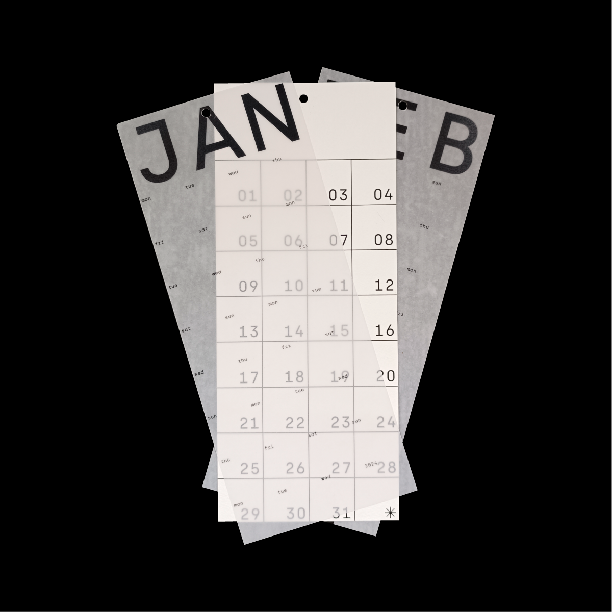
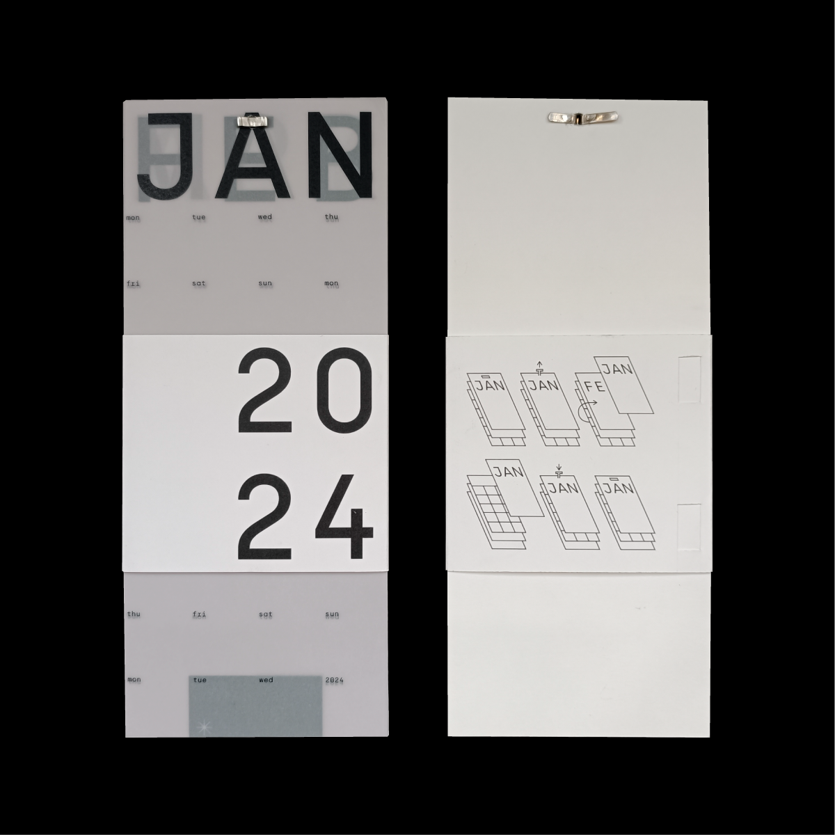
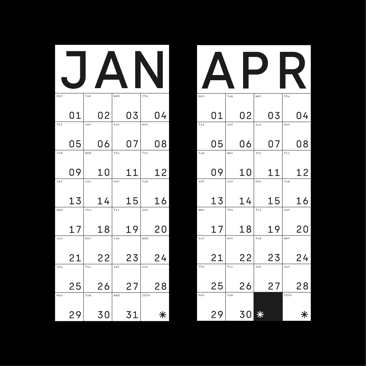
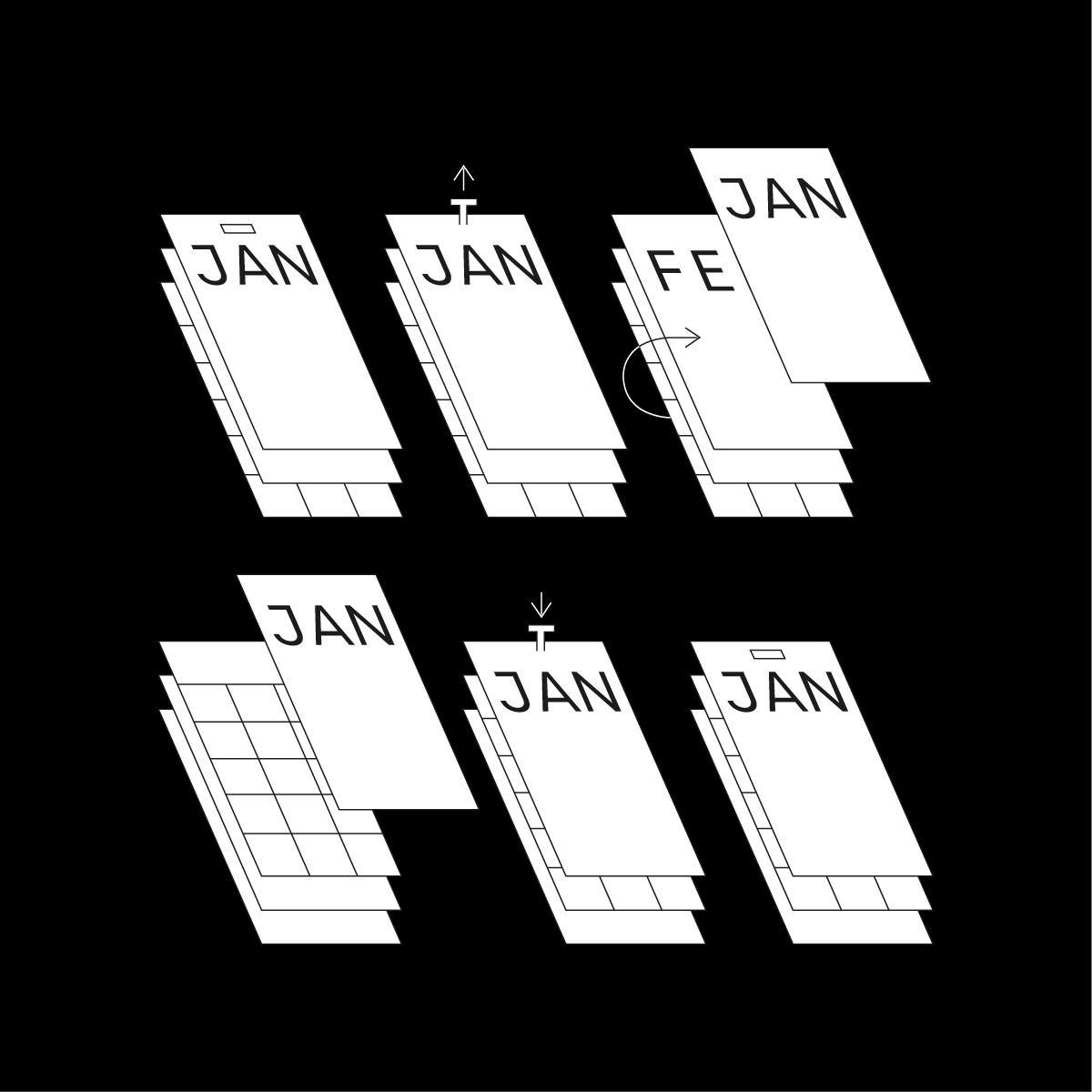
For the publishing course, we were asked to make a diary for 2024. I decided to make a diary using transparent sheets. All the months of the year were printed on transparent sheets, with all the days making up that month. To structure the calendar, there was a white sheet with a grid and numbers behind it. When the transparent sheet containing the month was superimposed on the white sheet containing the squares and numbers, the calendar was structured and completed, with the squares appearing behind the transparent sheet, which could then be written on. Once the month was finished, there was a small fastener that could be removed, so that the sheet for the finished month could be removed and the sheet for the following month placed in front of the white sheet. An illustration on the back of my calendar explained what to do.
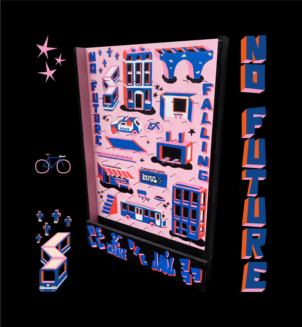
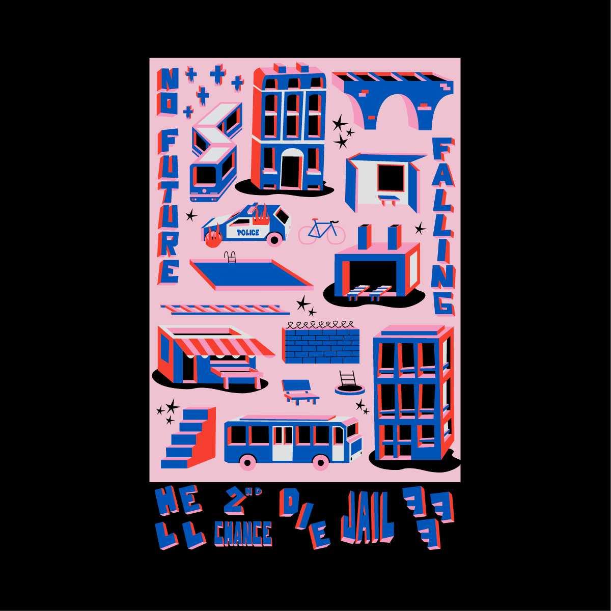
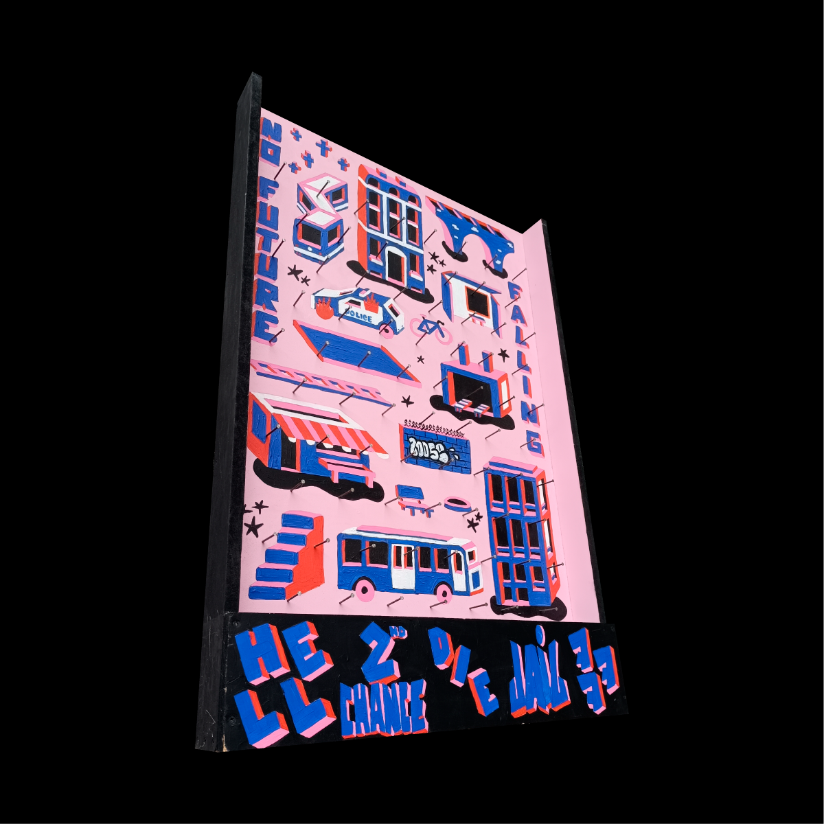
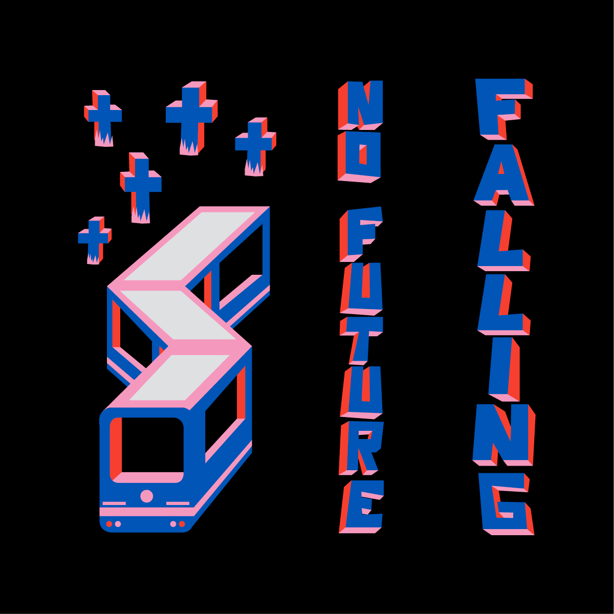
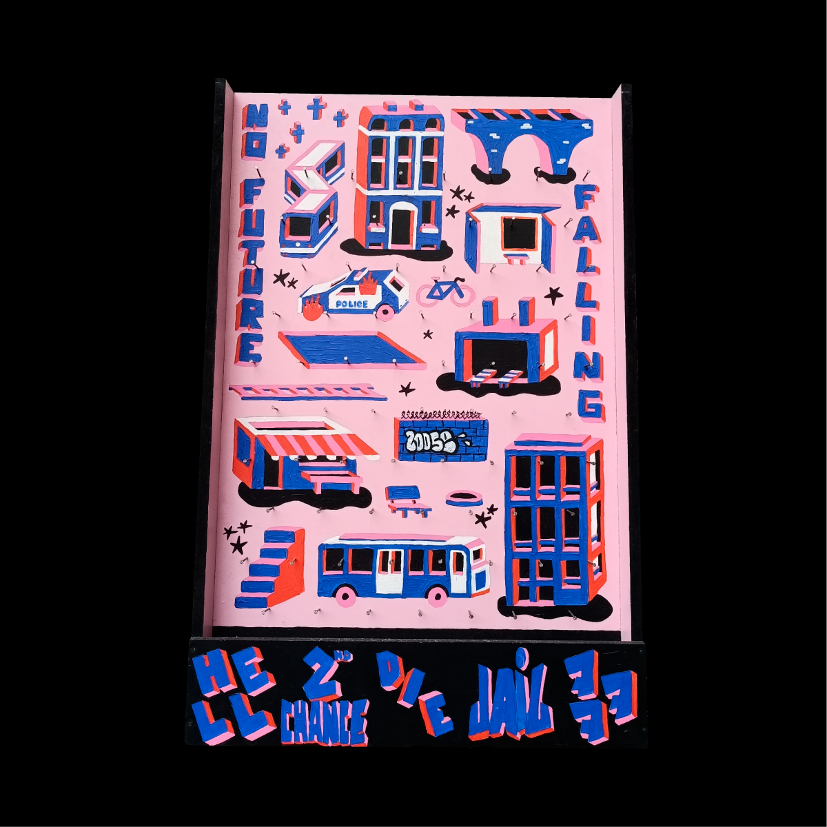
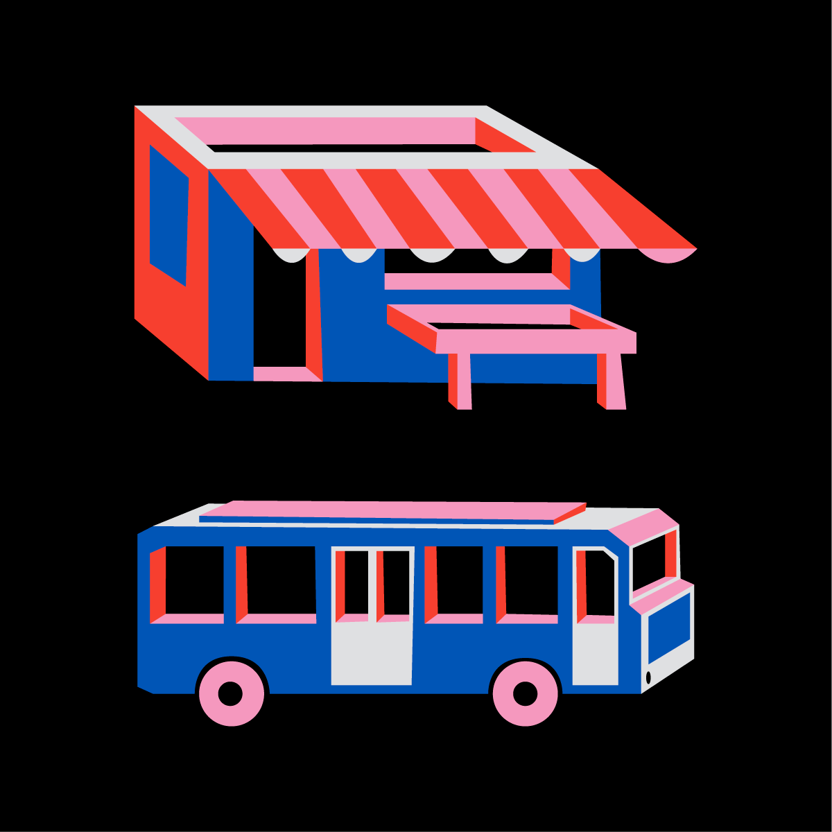
As part of a course, we were asked us to create a project on a wooden board, in which we put elements from our lives that led us to the studies we're doing today. I then drew several elements that were part of my life at the time (obviously I didn't burn a police car as in the drawing you can see, but during adolescence many of us had this rebellious side towards the forces of law and order that I obviously no longer have today). First I drew all the elements on the odinator, then I used a projector to redraw everything on the board and then painted it by hand. Translated with DeepL.com (free version)
I'm Adrian Sadoun, graphic designer who recently graduated with a Master's in Publishing from ESA Saint-Luc Liège. I am passionate about art in general, and this is what led me to pursue studies in graphic design. My area of expertise is typeface design.
Experience :
School :
